Thursday, 28 July 2016

Top 10 SEO Reputation Management Tools Online

man-coffee-cup-pen

Editor’s Note: This post was originally published in February 2012 and has been updated for accuracy and comprehensiveness. 

If you learned nothing in high school, you learned that you do have control over your reputation and your reputation is elastic and can be changed. This same lesson works for businesses looking to shape and reform an online reputation; the difference, however, is that you have web tools to help you make it happen. Before jumping into the different tools available, it’s important to understand some of the things that help give your business an online reputation—or the way that online readers perceive your business—in the first place:

  • Social Media. What you post on social media and how you post it can immediately make or break a reputation. For example, if you’re only posting your own articles, it might seem as though you’re disinterested in learning from others or reading about your industry. If you’re rude to someone on social media or ignore a comment back, you might also be perceived as disinterested or unable to respond.
  • Content. Whether or not your content is true, well thought-out, relevant, and detailed will matter when it comes to how you’re seen online. Your content shows what you know, so you have to make it count. That means researching topics, weighing in on difficult subjects, and offering real utility to others through the content you post.
  • Web Design and Layout. A sloppy layout indicates a sloppy company. People want web designs that are organized and engaging, and search engines want that, too. Having the best content in the world won’t matter if users or search engine crawlers get too tripped up in your layout to find it.
  • Employee Contact. Talking with one of your employees online counts as part of your online reputation. Contact information should be easy to find and clickable. Many brands have even taken to chatbots to assist and represent the brand; others have contact forms. Whichever route you choose, make it visible.

In short, it’s the sum of the basics that help shape your online reputation. Learning to evolve your brand the same way you’d expect and individual to grow is key to managing a successful and compelling reputation.

Top 10 Reputation Management Tools

Part of managing your reputation is being able to look at data and analytics and draw a conclusion about your current performance. You must have a strategy in place to manage the aforementioned factors of reputation, and then you must have some way of gathering data to make sure you can gauge that reputation at any time. Check out some of the best tools around to help make it all happen:

  1. Trackur. This tool will show you what people are seeing when they search for you in Google or any social network. By monitoring social media, mainstream news sources, and more, Trackur delivers social analytics that reveal the trends and insights your brand needs to succeed. It also lets you know if the people talking about you are influential in the industry or not.

Price: There are three different plans with prices ranging from $97-$400+, but each plan has a free 10 day trial.

  1. Naymz. The tool with give you a RepScore based on how people find your brand as well as through your social influence (measured by social sharing indicators). Peer assessments tell you how trustworthy and reputable your brand appears, and then gives you management tools to strengthen your online presence.

naymz Top 10 SEO Reputation Management Tools Online

Price: The best part-the tool is free!

  1. BrandsEye. The nice thing about this tool is that multiple people in your office can have access to working with it. It offers all the basics of reputation management, but has a sophisticated algorithm that analyzes and interprets data.

Price: There is a two-week free trial available.

  1. Brandwatch. This is a popular tool for social media management and keyword monitoring. It centers on gathering customer feedback and public opinions, and then using the information collected to inform your decision-making process.

brandwatch Top 10 SEO Reputation Management Tools Online

Price: There is a free demo available.

  1. Technorati. This one is good for beginners or those who want basic results. It will track your blog posts to see who’s linking back to that post, which gives you a good indication about how successful that post was with your readers. You can also subscribe to alerts for this information.

Price: The tool is completely free.

  1. Rankur. This is a good tool if you’re a small company, yet it still offers a lot of analytics and demographic information. It helps you see your online reviews, monitor competitors, and has a team workflow feature. Plus, it’s available in many different languages.

rankur Top 10 SEO Reputation Management Tools Online

Price: There is a free plan option available as well as three paid plans.

  1. Alterian/SDL. This is one tool that offers tons of information and data. You can discover what people think of your brand in different countries, from different demographics, in different languages, etc. In other words, it gives you everything you need to know about your online reputation and tools that cover everything from campaign management to marketing analytics.

Price: No free trials and, unfortunately, expensive pricing options ($500+).

  1. SocialMention. The greatest thing about this tool is the fact that it can send you alerts for all of your keywords. It also analyzes when your brand is mentioned and just how important those mentions actually are.

Price: Free

  1. Whos Talking. Similar to SocialMention, this tool can alert you when your keywords and brand are mentioned. You can see mentions on almost all social media platforms as well as videos and images; however you can only look at one “type” of mention at a time.

Price: Free

  1. Google Alerts. This is probably the most basic form of reputation management, but it’s also the easiest. You simply add in the term you want to track (most likely your company name), and you will get emails telling you when and where that word was mentioned. It doesn’t do any type of analysis for you, but it gives you the facts.

Price: Free service.

In the end, the tool you choose is all about what you feel you need the most help monitoring. If you think you do a great job with content, but really need help with social media, find a tool that focuses specifically on that aspect and run with it. Regardless of which tool you choose, be mindful of your brand’s online reputation and always strive to improve it.


The post https://www.highervisibility.com/blog/top-10-seo-reputation-management-tools-online/ appeared first on https://www.highervisibility.com

Tuesday, 26 July 2016

Hiring a web designer? Read this first.

apple-camera-desk-office

Whether it’s a complete website redesign, a few page templates, or the creation of a mobile app, it all requires the unique skill set of a designer. If your business is lucky enough to have one in-house, congratulations; if not, we have some pointers for you.

Navigating your way through the process of hiring a designer can be difficult, especially if you’ve never worked with one. The world of web design and construction is a complex art, which can make communicating what you want challenging. Not knowing what to ask and how to ask it is something many people in search of designers struggle with, and it can lead to a difficult partnership, mismanaged projects, and unsatisfied clients.

To avoid all of that, try preparing yourself with a few of these tips. These suggestions come straight from designers and will help you find the artist best suited to meet your needs while also developing a positive, professional relationship.

Phase 1: Do your homework.

  • Before you go contacting a bunch of digital firms, you need to at least loosely identify what services you’re after. Are you looking for mobile app development? A website re/design? Branding graphics material? Going in with some clarity about the specific goods and services you’re interested in buying will keep you grounded.
  • Once you get an idea of the type of project you’re after, research the rates of designers in your area. Freelance designers and developers typically charge by the hour, whereas a digital firm is more likely to charge by the bundled project. The rates for digital development services will vary considerably, as determining prices for projects is a notoriously tricky task for those in the industry. Find out what you can about what other people have paid for and go from there.

Phase 2: Narrow down the choices.

  • With a clear idea of what you’re after, you can start looking for your digital provider. I recommend looking for a local designer first. As an obvious advantage, you’ll automatically have location in common with them, and can visit their creative space/office to get a feel for their style. It’s okay to cast a broad net and speak with designers both local and remote, but be sure to record your initial thoughts after. Ask yourself: Were they easy to speak to? Did they seem knowledgeable and add to my ideas? Can I see myself working with them long-term? The answers to question such as these will help you with later comparison.
  • Be sure to browse portfolios and samples of past work, most of which should be available online. Looking at the projects they’ve done will give you an idea of the kind of clients they’re used to working with, their capability in pioneering style, and a visual of their talent. Indications of client versatility are always promising. Also along the lines of checking into past work, you can always speak with a designer or firm’s past clients. This will give you an idea of how easy the designer/developer is to work with, how cost-effective and timely the project was, and much more.

Phase 3: Secure the contract.

The importance of clarity during the contract phase cannot be understated. Before signing or agreeing to anything, make sure you have a firm understanding of the following:

  • A clear understanding of billing cycles, what the payments are and what you will receive in exchange for payment.
  • Working deadlines that can be adjusted if necessary, as well as a well-structured timeline for the project.
  • A clearly defined creative process. This means knowing who your point of contact is, knowing how involved you will or will not be in the creative process, and knowing the developer who will eventually explain the project and turn it over to you. Not all designers and developers involve client feedback or encourage clients to watch while they work on the project, and you need to know ahead of time if you’ll be comfortable with the creative process.
  • Knowing what you own and what you don’t own. Most designers and developers work with content management systems like WordPress or Magento, so that when the project is complete, they hand over the file and it becomes your property. However, some digital firms have their own CMS they use, which can make it really difficult should you change your mind and choose to take the project in another direction. Avoid any potential ownership conflict by getting a thorough detailing of who owns what, in writing, before signing.

The post https://www.highervisibility.com/blog/hiring-a-web-designer-read-this-first/ appeared first on https://www.highervisibility.com

Friday, 22 July 2016

6 Absolute Musts for an Awesome Facebook Page

FB

Facebook has continued to add features and updates in an effort to be king of the social media hill. And, despite controversy regarding Facebook staff suppressing conservative news content and breaching the location privacy of its users, it remains a major platform with irrefutable influence.

The number of businesses active on Facebook has climbed to about 50 million, meaning that at this point, if your business doesn’t have one, you’re just willfully choosing to miss out on a preferred medium for reaching consumers. Facebook has become a one stop shop: users can get their news, shop, interact with chatbots from their favorite brands, and still keep in touch with friends on the massive social network they’re accustomed to.

How, then, do you as a small (or large) business owner insert yourself into that action and become part of user conversation? With 50 million other business pages on Facebook, how can your business stand out and attract users?

While the mere presence of a business page is a step in the right direction, there are certain things you can do to make it more appealing and, above all, useful for users. The trick is to seamlessly add yourself into their feed of news and posts, so that clicking on your page is as natural as but more appealing than the rest of the feed. But before you can do that, you have to build up your page with the basics. These 6 absolute musts will get you started on producing an awesome Facebook page for your business.

1. Have a recognizable photo. If your company or brand has an easily recognizable logo, that’s exactly what your profile picture should be. It’s helps users quickly identify your brand, and gives a “face” to the Facebook presence they’re interacting with. Take Nike, for example. Would you expect them to have any profile picture other than their iconic logo?

nike 6 Absolute Musts for an Awesome Facebook Page

At this point, Nike branding is so effective that nearly anyone on the planet can recognize their logo without seeing the company name. Try and aim for that kind of identification power behind your brand. If consumers associated your brand with a single image or symbol, what would it be? That’s your profile picture.

  • Your cover photo is an opportunity for meaning that bolsters that of your brand and profile picture. Think of it as something to communicate the current happenings or themes of your brand. For example, Coke is currently promoting their new bottles and cans that have song titles listed on them, so that’s what their cover photo has a picture supporting:

coke 6 Absolute Musts for an Awesome Facebook Page

2. Be thorough in your ‘About’ section. Look in this section of just about any business or organization and you’ll see a few things: a location, hours, a phone number, and a link to the website. It should also include a brief company description, the mission statement or overall objective of your company, and maybe even some core values. This is where you put the background information of your business, so get specific.

3. Link to other apps. This is a great way to maximize your reach and unify your pages across multiple platforms. By visiting the Facebook App Center, you can add links to your profiles on apps like Instagram, Twitter, Pinterest, and more. This is particularly helpful for mobile users, because in just a click they can connect with your brand on their favorite platform. Plus, it keeps the brand accessible and present.

4. Produce visually satisfying content. A big part of creating click-worthy content on Facebook is having significant visual appeal. Your posts should enhance and contribute to the feed of users, while also effectively representing the overall aim of your brand. Patagonia is particularly successful in creating posts with strong visual appeal:
patagonia 6 Absolute Musts for an Awesome Facebook Page

patagonia2 6 Absolute Musts for an Awesome Facebook Page

The idea is to share content that adds value to what users are already seeing in a way that emphasizes your brand. As you can see in the above posts from Patagonia’s Facebook page, they offer intriguing snippets of rich content that support their commitment to the wild and beautiful outdoors.

  • Two main reasons users unlike a brand are because it shares uninteresting posts and because it shares too many posts. Observing the balance between too few posts and too many is important, but it’s an issue that sorts itself out when the content being produced is of high quality. Do some research about your customers and try and draft a content posting plan that achieves an appropriate balance.

5. Use a call to action button. Facebook offers seven pre made call to action buttons, and there’s no reason not to use them. At the very least, you should have the “Contact” call to action button, so that a user could easily click and call from any device. For retailers, the “Shop Now” call to action button is a great idea, because it simplifies the purchasing process and prompts user to buy.

central 6 Absolute Musts for an Awesome Facebook Page

Having a call to action button front and center will prompt your page visitors to, if nothing else, browse merchandise out of curiosity and potentially make a purchase.

6. Engage with your users. Responding to comments and interacting with users is a really important part of having an effective Facebook business page. Whether it’s a positive interaction or a negative interaction, regular engagement is key to connecting with your audience. Even companies as big as Starbucks manage to regularly engage with their customers:

starbucks 6 Absolute Musts for an Awesome Facebook Page

Every business has its share of fans and trolls, but how you respond to them is what defines your brand. Perhaps more than any other platform, Facebook is where users truly pay attention to comments and feedback made by other users, so be sure to engage with users regularly in a professional manner.


The post https://www.highervisibility.com/blog/6-absolute-musts-for-an-awesome-facebook-page/ appeared first on https://www.highervisibility.com

Wednesday, 20 July 2016

How to Spot Fake Testimonials and Reviews

feedback-1213042_640

Editor’s Note: This post was originally published in October 2012 and has been updated for accuracy and comprehensiveness. 

We all know that companies would prefer to have only good reviews, and that company performance is largely motivated by obtaining such feedback because it helps businesses thrive. Reviews play an important role, as ReviewTrackers.com reports that 85% of consumers read them to determine whether or not local businesses are good or not. However, many people don’t realize just how many fake reviews really exist, posted everywhere from company websites, Google reviews, and social media. In response to the demand for positive reviews, some companies have actually taken to paying for them, and even more have cashed in on the need by creating review mills.

Reviews and testimonials are supposed to help someone make a decision about a company, but it can be tough to trust in these reviews knowing how easy it is for a company to add fake reviews. This leads many to wonder: Is the review I’m reading even real?

For the Users: How to Make Sure You’re Not Falling for Fake Reviews

Fortunately, there are a few different things that users can do to make sure they aren’t falling for reviews that a company paid for or wrote themselves. A few of these tips include:

  • Compare Reviews. Always be sure to look at more than one source. Look at Google reviews, Amazon reviews, Yelp reviews, testimonials, and even take to Quora. See where there is consistency and where there isn’t, and look for authentic experiences. This is particularly helpful on Facebook business pages, because you can see the user who’s posting about their experience, and even comment/interact with them about it.
  • Read the Reviews More Than the Ratings. You should always read the reviews as opposed to just looking at the number of stars given and moving on. Depending on how many reviews total there are, the ratings can sometimes be misleading. In some cases, people give something a bad review for personal reasons that are irrelevant to you, and it ends up affecting the rating. Aim for the middle ground by looking for businesses that have consistency between reviews and ratings (for example, a business with a handful of really positive reviews but a couple poor experiences and an average rating).
  • Follow Trends, But Be Open. If you have seen a trend of good or bad reviews over a few weeks, you can usually believe what they have to say more so than individual ratings. I once came across a cleaning service I wanted to hire, but upon searching for them found only bad reviews. I told the manager I had reconsidered hiring them because there were only bad reviews, and it turns out they had completely new management and had drastically changed their approach. The manager told me if I wasn’t satisfied the service would be free, but if I was satisfied I’d have to write a great review (I ended up more than satisfied and wrote an awesome review). In short, look for trends and don’t be afraid to ask the business about concerns you have after reading reviews.
  • Assess the Reviewers. If you can check-up on someone who gave a rating that really changed your thoughts, do it. If their review and experience are valid, they’ll more than likely be happy to share their thoughts about the business with you, and you’ll end up with a firsthand referral/deferral.

It’s certainly annoying that consumers have to take these measures to really trust what a company says, but it’s good to know that there are at least options out there that work.

For Businesses: Are Fake Reviews a Bad Idea for Companies?

Believe it or not, some companies have seen value in creating their own reviews because it gets the ball rolling. Sometimes startup businesses need that extra push to get started, and reviews are great ways to make that happen. This then begs the question: As long as the fake reviews stop after one or two, is it okay to give yourself this head start?

Most would say it is unethical, and I would have to agree. There are other ways to start building up your business’s review reputation without creating fake reviews, such as incentivizing writing reviews, streamlining the review process through an email, or simply by offering outstanding goods and services that inspire customers to give positive feedback. By now, many people have review apps, such as Yelp, and are already accustomed to writing reviews for their own benefit. Encouraging customers to talk about their experiences just gives the extra nudge they need.


The post https://www.highervisibility.com/blog/how-to-spot-fake-testimonials-and-reviews/ appeared first on https://www.highervisibility.com

Tuesday, 19 July 2016

4 Style Tips for Formatting Your Blog Posts

format

Among my greatest pet peeves is inconsistency in blog post formatting. In putting together my own blog posts, I find myself meticulously checking my use of bold and italics, double checking words that can or cannot be hyphenated, and triple checking the overall flow of the text.

Developing a personal style in your writing format is just as important as producing content on a consistent basis. That personal style can-and should-include the tone and voice behind your blog posts, and it also refers to the distinct style of your brand or business. Adhering to a specific formatting guide not only keeps your content pieces consistent, but it also makes your brand more recognizable.

It’s not at all uncommon for businesses to develop a style/branding guide, detailing specifics right down to the font type and hue. Giving a uniform to the content you produce helps with streamlining the production process and gives your site the consistent, credible aesthetic it needs. Whether you’re trying to develop a comprehensive style guide or just looking to polish your personal blog, these are the tips to get you started.

Auto-Formatting

Many website platforms have an auto-formatting component built in to the template design. You can save yourself a lot of time by determining in advance the font, font size, color scheme, and post layout that all of your posts are going to have. That way, even if you copy and paste from another document, all your posts come out looking the same.

Grammar

This one gets overlooked a lot. What I’m mainly referring to is the consistency with which you use certain words or phrase. For example, if you’re going to use the oxford comma, commit to using it all the time and in every post. If you’re writing a summary of something, use the same tense throughout the summary. If there are industry words or phrases that can be written multiple ways (e-commerce, ecommerce, Ecommerce, etc.), choose one and one only. Viewers look to websites for information and understanding, so keep your message and how you deliver that message steady.

Text Style

Also along the lines of auto-formatting is the way you style the text in your posts. When posting a lot of information or creating a list, do you use bullets or numbers? In formatting different headings, are they bold, italicized, or underlined? Will text wrapping in posts be acceptable? Establishing set answers to these questions will not only help give your site a more identifiable look, but it’ll also help your guest posters or contributors have clear guidelines to follow.

Image Use

You don’t necessarily have to pledge allegiance to gifs or graphics, but it is nice to have some style guidelines for image. Even if it’s only a standard size guide or pixel requirement, it contributes to a more uniformed look that supports the authority of your posts.


The post https://www.highervisibility.com/blog/4-style-tips-for-formatting-your-blog-posts/ appeared first on https://www.highervisibility.com

Friday, 15 July 2016

SEO Checklist for Ecommerce Websites

american-express-89024_640

Editor’s Note: This post was originally published in February 2013 and has been updated for accuracy and comprehensiveness.  

SEO is similar in all industries and for all types of companies, but there are things that differ based on whether you own a franchise, a blog, a B2B versus a B2C company, and finally, an ecommerce website. Once you have a basic understanding of how SEO works, it’s important that you understand how it pertains to the type of company you own, and which practices best fulfill your goals. Creating a checklist is a great way to do this.

Ecommerce SEO Checklist: 16 Things in 2016

Retail ecommerce has become an increasingly profitable industry with extraordinary opportunity for profit. When it comes to SEO, there are many things to keep in mind that are specific to ecommerce websites. Below is a checklist to help you get started:

1. Minimize load time. Nothing is more annoying to a customer shopping online than a website that just won’t load. More importantly, Google’s algorithm accounts for site speed, and a delayed site could be hurting your rankings. Believe it or not, this is in the control of the webmaster. Make sure that you are removing any unnecessary plugins, decreasing HTTP requests, and using external CSS files. You might also consider upgrading your website hosting (note: the fastest hosting comes at a cost).

2. Create something interactive and engaging. This might sound obvious, but it’s not as easy as you think. You want to put a lot of effort into making sure that you have an attractive website design, polls and surveys to get people to participate, interactive infographics, and a short and easy way for someone to sign up to make a purchase. Makeup giant Sephora does a great job of this by employing quizlets and virtual try-ons of their products:

Sephora-stock SEO Checklist for Ecommerce Websites3. Think mobile. This is not optional. Mobile optimization is an absolute must, because more searches are being completed on mobile devices than desktops. With the conversion rate of mobile searches being so much higher than that of desktop searches, it’s just plain unwise to have an ecommerce website that isn’t mobile-ready. Accounting the mobile gold rush means creating mobile responsive ads, have a mobile responsive site, and making sure you have visible, clickable information and products. Learn more here.

4. Remember social media, and consider Pinterest. By now, most companies know that powerhouse platforms like Facebook, Twitter, LinkedIn, and Google+ are crucial when it comes to gaining clicks and visibility for businesses. But for ecommerce websites, Pinterest is an important resource that often gets overlooked. With a growing 100 million active users, the platform, Pinterest generates over 400% more in revenue per click than Twitter and 27% more per click than Facebook. That’s a lot of potential for driving sales (but don’t skip the third checklist item, because about 75% of Pinterest traffic comes from mobile users).

5. Optimize title and description tags. Optimizing these tags with a keyword helps tell the search engine bots what your website is about, and that’s crucial when it comes time to rank and index a site. It’s also just as important to make sure you aren’t promoting keywords that people aren’t actually searching for.

6. Put your products on your homepage. Your homepage is a huge factor for how search engines analyze your site and give you a PageRank (not to mention it’s the first thing customers see). Good ecommerce SEO means having a product no more than two or three clicks away from your homepage, and highlighting special offers and deal on the homepage as well.

7. Keep page volume low. Also along the lines of keeping products only a few clicks away is site depth. A customer should always be able to get back to the homepage within 2-3 clicks. Try and structure your site with clear, broad categories, and avoid death by subcategory indexing.

8. Start a blog and guest posting strategy. Now is the perfect time to create a guest posting strategy as well as a blog in order to gain backlinks and increase visibility. Doing so usually involves hiring a writer to pitch different websites and write content related to your niche. Adding a blog component to your website is also an excellent when to assert yourself as an authority within your industry, as well as share ideas, experiences, tips, and more with your clientele.

9. Have lots of product reviews. You want to give your customers an outlet to discuss your product or service. Prospective customers look for the past experiences and opinions of your business and Google likes to see the interaction, so if you’re getting good reviews, it’s a win-win-win situation. Plus, it never hurts to bolster the reputation of your brand.

10. Create a product compare option. This is one practice that works particularly well for ecommerce websites, because it poses suggestions to consumers. It’s obviously great if your users are able to look at your products and compare them with others, but it’s also great for SEO because it generates so many internal links.

11. Apply rich snippets. Rich snippets are little graphics, videos, or extra pieces of information that show up on a search engine results page. These work well because it helps to differentiate your results from the rest, and it allows search engines as well as users to see what your website is about without having to actually click because it gives a preview.

12. Use CMS systems. Companies are still ignoring content management systems (CMS) that work well and improve performance for ecommerce sites. CMS systems make it easy to update your products as well as add content about them onto your site pages. The most popular CMS system for Ecommerce sites is Magento, which has nearly 21% of the world’s top 100,000 ecommerce sites built on their platform. You can learn more about CMS and how to get started here.

13. Optimize all your images for search. Make sure that the search engine bots know what your photos represent by putting alt tags in the images. It might not seem like much, but it does make a huge difference when it comes time for Google to analyze your site. It shows that every part of your site is important and gives weight to images.

14. Have an XML or HTML sitemap. This is crucial if you have a large Ecommerce site (more than 100 items) because it will automatically update whenever you need to revise or change your products. Having to go through and manually update pages would be a tremendous waste of time you could spend improving other marketing/ecommerce strategies.

15. Keep URLs readable. You won’t have to worry about the optimization of your ecommerce site if no one wants to click on the link that leads to it. Plumping URLs with keywords that can quickly indicate to the user what the link is about is a huge part of generating traffic. Refer to the image below:

mozcapture SEO Checklist for Ecommerce Websites

16. Write unique product descriptions. Duplicate content is punishable by search engines, which is why you can’t use the same product descriptions over and over again. It’s also why can’t and shouldn’t use manufacturer descriptions of products. An ecommerce best practice is to write a couple hundred unique words for every product description. It’ll help your rankings by keeping content original.

Many of the items included in the checklist will work for other types of businesses just as well as they work for Ecommerce sites. Still, it’s important that you put these things on your as a top priority for your 2016 SEO practices, because ecommerce will only continue to become more competitive.


The post https://www.highervisibility.com/blog/seo-checklist-for-ecommerce-websites/ appeared first on https://www.highervisibility.com

Thursday, 14 July 2016

Three things marketers can learn from Lokai on social media

If you think social media is a big deal now, you’ve seen nothing yet. Social media is poised to take over the world, or at least it’s heading in that direction.

By 2018, projections are that some 2.44 billion people will be using social media in one way, shape or form. That’ll be about one third of the world’s population.

Yes, indeed, whether you’re talking about Facebook or Twitter, LinkedIn or Instagram, social media user sizes are huge.

You? Not so much. You’re just one lone brand, personal or professional, in a vast sea of accounts, each and every one of which is trying desperately to stand out among a cacophony of content.

With the half-life of a tweet less than a half hour and complex, ever-changing algorithms on most major channels undermining reach and engagement, marketers who don’t have to work harder than ever to use social media effectively are few and far between.

Unless whatever it is they happen to be marketing has got it all going on like Lokai.

Even if you haven’t heard the name of this brand, chances are you’ve seen the product being worn on someone’s wrist.

lokai

It’s a simple, silicone bracelet that has been the latest rage and fashion accessory of famous athletes, celebrities and everyday people like me and you for the last few years.

And while this brand may not have to work as hard as others to succeed on social media, its popularity may have as much to do with how well it works the crowd – both online and in real life – as it does with how lucky it is to have such an outstanding product.

Here are three things any marketer, B2C or B2B, SMB or enterprise-level organization, can learn from Lokai’s activities on social media and be a standout themselves…

1. Tell a good story

People are curious and inquisitive, if not downright skeptical. There’s a backstory to every product or service that your audience doesn’t just want to hear, but needs to hear.

It’s this story that makes your brand more genuine, unique, credible and believable. Trust is something that is earned, not given.

No brand is born overnight. In Lokai’s case, it was the brainchild of young entrepreneur, Steven Izen, who while still a student at Cornell University, came up with the idea for the bracelet.

Inspired by his grandfather’s Alzheimer’s diagnosis, the black bead contains mud from the Dead Sea, the lowest point on Earth, to represent the sadness Steven felt at the time. The white bead carries water from the highest point on Earth, Mount Everest.

The name of the bracelet is a takeoff on the Hawaiian word, Lokai, which means unity and the combination of opposites, the hopefulness we feel when things aren’t going well and the humility we should exhibit when we’re on a roll.

Do you have a story to tell to your own audience? How would it begin? Where would it end?


2. Build a strong community

Modern marketer extraordinaire Seth Godin wrote about it in his 2004 book, Tribes. Speakers at a GaggleAMP  conference I recently attended at Bentley University preached about it. Popular rock bands have had them for years.

Whether you call it a tribe, a gaggle or a fan club, you need to build your own tightknit community of people who live, breathe and adore whatever it is you have to offer, people who like to talk amongst themselves about what makes your product or service so special, people who are unabashedly proud to show off whatever you have to offer to their own personal networks.

These are your very best customers, those who are going to gloat, advocate and evangelize on behalf of your brand.

Lokai has them in celebrities such as Justin Bieber, Ariana Grande, Cam Newton, Paul Wesley and Gigi Hadad – each of whom has been photographed wearing the cool, newfangled bracelets – in addition to literally countless others, who they celebrate and embrace on both their website here and on social media everywhere.

Who are your devotees and how do you reward them for their loyalty to your brand?

lokai instagram

3. Have a great cause

Many brands struggle to find any semblance of their own soul – if they even have one – never mind to actually use it to their advantage in their marketing campaigns.

Yet like sharing a good story, baring your soul for your audience to see can be especially good for business. Associating yourself with a cause worth supporting betrays the human, compassionate side of your business, the side that may appeal to your constituency as much as your products and services.

It shows you have a kind soul, if not a good heart, too. In Lokai’s case, 10% of bracelet sales’ net profits are “dedicated to giving back to the community through a variety of charitable alliances.”

Different, limited-edition colored bracelets associated with specific charities – such as Oceana, Make-A-Wish and The Alzheimer’s Association – are also rolled out from time to time, creating a strong sense of urgency around the buying process.

When all is said and done, cause-associated social media marketing can provide a big boost to sales, and certainly can serve as a win-win business model. What nonprofit organizations mean the most to you and your colleagues? How can you do well by doing good?


The article Three things marketers can learn from Lokai on social media was first seen from https://searchenginewatch.com

11 quick UX tips to improve landing page conversion

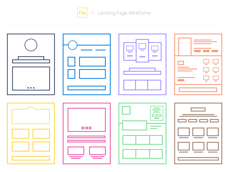
It’s easy to create a landing page to promote a product, or a service, but is it really conveying your message to boost conversion?

Landing pages can be a great starting point for a business to promote a new product, or a service, but it’s becoming more challenging nowadays to convince customers to trust you.

There’s an increasing online clutter that can make an landing page look spammy, but there are always quick fixes to improve conversion, especially when focusing on user-experience.

layout-1

Image Source: Soumya Kanti Paul

Every landing page is focusing on a particular target audience, which means that it’s vital to grab their attention, keep them engaged and eventually turn them into clients.

The sales funnel is becoming more difficult day-by-day as the competition is rising, so if a landing page is the introduction to your company, then you might need to use the following tips as a checklist on how UX can improve your conversion rates.

1. Keep it minimal

A landing page’s design should be clear and minimal, in order to avoid any confusion among visitors.

An appealing and simple design may lead to more impressive results than an overstuffed page, especially if it manages to serve its purpose.

Screen Shot 2016-07-12 at 21.40.53

2. Think like a user

This should be your first step when creating a new landing page. Before start its design and its formatting, think of your target audience.

  • Who is your audience?
  • What’s the best way to communicate your message?
  • How will the product benefit the audience?
  • What would make users sign up to the service?
  • How can you increase the conversion?

Screen Shot 2016-07-13 at 11.40.40

All these questions (and even more) can help you understand your target audience and create the perfect landing page, depending on their needs and their expectations from your company.

Even if they haven’t heard about your service before, if you are able to analyse their online behaviour, then you’re already on the right track to create an effective landing page.

3. Use simple language

Don’t underestimate the importance of content when creating a landing page. Visual content may prevail in the online world, but written context will always be powerful. There’s no need to use jargon, or complex language that can alienate users.

Once again, think like a user, shape the message in your head, read it out loud and aim for clarity.

Screen Shot 2016-07-13 at 11.33.33

If you can’t explain your concept to your users in its simplest way, then you probably need to reconsider your message.

4. Ask for as little information as possible

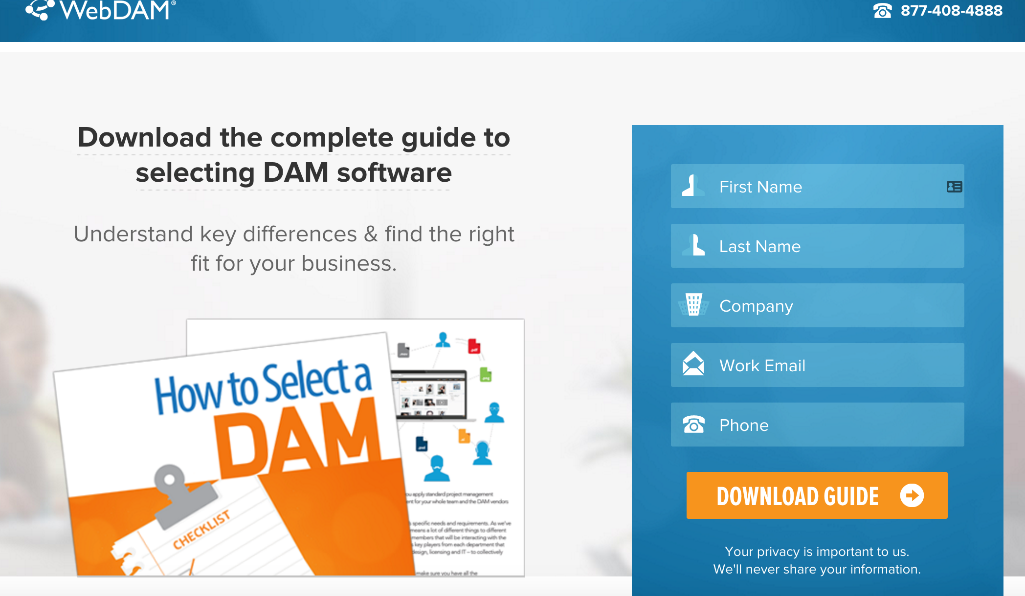
Whether it’s a signup field, or a newsletter subscription, a user-friendly form is crucial for the success of a landing page.

Screen Shot 2016-07-13 at 11.47.04

People are wary of sign up forms and giving out their personal details, so make sure that you’re only asking for what’s necessary. Find a reason to convince users to trust you, whether it’s a reward, or a highly appealing and relevant landing page, and return the trust with a quick and simple registration process.

Or else, you’re simply reducing the chances of increasing conversions with a simple mistake that could be avoided.

Screen Shot 2016-07-13 at 11.26.59

5. Create a powerful CTA

Your call-to-action should contain your message in the most appealing way, both aesthetically and functionally. It’s not always easy to achieve this without the proper testing before, so be prepared to experiment with the effect of colours, shapes, sizes, and fonts for your CTA.

Will you create a button, or will you focus on a form?

Screen Shot 2016-07-13 at 11.45.58

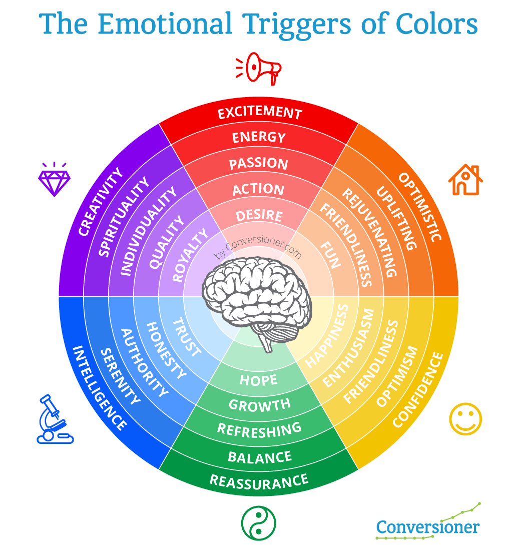
6. Emotional design

The emotional design of a landing page may lead to the strategical placement of the key message to the right area of the landing page, the one that a user may see first.

This can enhance the chances of turning the visitor into a conversion, while simple psychological triggers can help the process.

A landing page’s content should reassure the users of their safety, their values, their needs, their importance, their personality, or even their time.

Even the use of colours may affect the user’s psychology and this is another reminder on why we cannot underestimate the needs of the user when creating a landing page.

5emotional

7. Use the right visuals that support the landing page

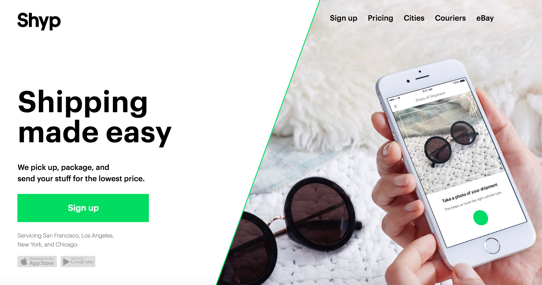
Visual content can significantly enhance the appeal of a landing page, provided that it’s meaningful and it is supported by the right text.

teads

There’s no need to fill a landing page with stock images just to make it more visual. Once again, simplicity is appreciated by customers and visual content may only increase the conversion rate when it manages to:

  • boost the message of the landing page by making it clear
  • explain the product/service in just a few minutes through a video, or an infographic
  • showcase real examples
  • build engagement

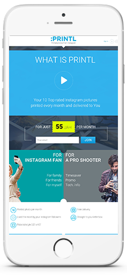
8. Optimise for mobile

Mobile optimisation should be a priority for every landing page, and 48% of users who visit a non-mobile optimised page take it as lack of interest from the business.

As mobile users keep increasing, 83% of them now ask for a seamless experience across all devices, considering it very important for their whole impression of a page. More and more users access a page through their mobile phones, which means that they should indeed access the same browsing experience among any device.

iphone-1

What if a user accesses your landing page through a smartphone to learn more about your product and has trouble finding the CTA due to the poor mobile design?

Mobile design is all about focusing on the user and UX is more important than ever, in order to deliver the best results, leading to an appealing and effective page.

After all, Google is serious about its mobile updates and it’s planning to include page speed as a factor on its next update, which means that optimisation is becoming more important, aiming for simple, clear, light pages.

If you’re still unsure whether your landing page is passing the test of mobile optimisation, then Google may help you with this tool.

If you need to learn more about mobile optimisation and how it affects a site’s performance, feel free to read more.

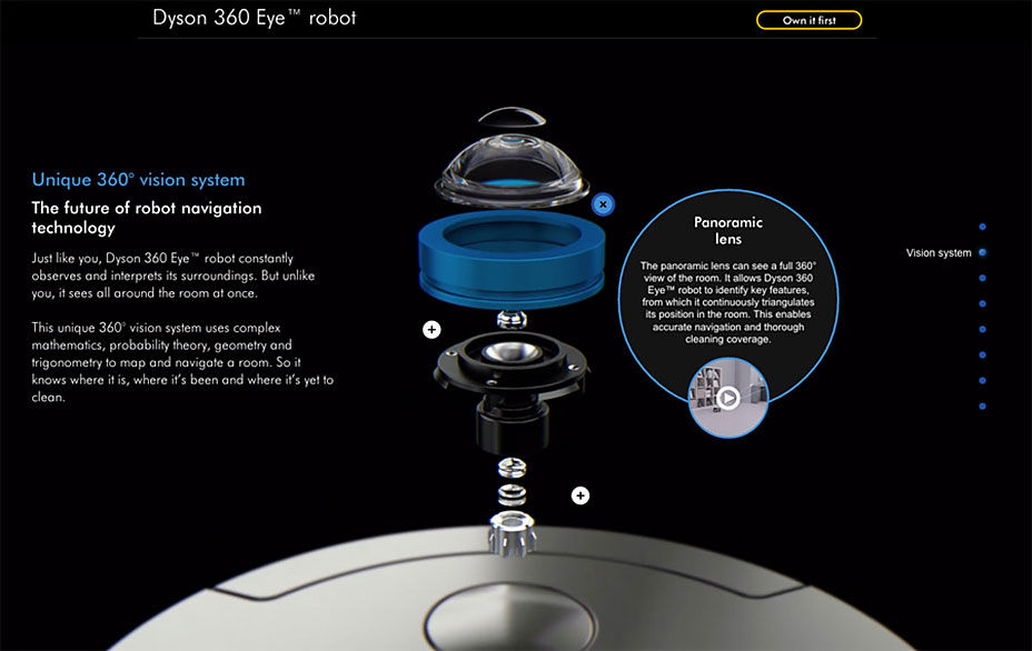
9. Solve a problem. Explain how you did it.

People visit a landing page to learn more about a product, or a service. However, the visit won’t last long if you don’t convince them about your actual value.

Direct selling and its relevant language is not working online, so it’s time to educate your audience about your service and how it may benefit its target users.

dyson 360

Each landing page and its product should aim to solve a problem and what’s more important is that it needs to explain how it is actually solving it.

If the message isn’t clear both on the offered solution, but also on its method, then the conversion rate won’t reach the desired levels.

Whether it’s a short explanation with bullet points, a video, or a graphic, your landing page should try to appeal to its target audience by presenting its value and the reasons they should sign up.

10. Remove navigation

There’s no need to include a navigation bar to your landing page, at least not if you’re trying to turn the visitor into a client.

A study back from 2013 measured that only 16% of landing pages were free of navigation bars (hopefully this has been improved lately), although it has been tested that the presence of a navigation bar affects the conversion rate.

There’s no need to make a user’s visit shorter or complex with the use of an additional menu, so maybe it’s time to remove navigation and test the results.

11. Leave out distractions

Distractions can be found everywhere and as our attention span gets shorter, it is becoming more difficult to focus on a single page for more than 5-10 seconds.

This makes it more difficult for a landing page to grab a user’s attention, to the extent that the conversion is achieved and that’s why the page’s design should leave out as many distractions as possible.

Whether it’s a banner, a pop-up, a menu, or an external link, make sure your page’s design is not blocking you buying funnel and your goal to turn visitors into customers.

Screen Shot 2016-07-13 at 11.29.00

Examples

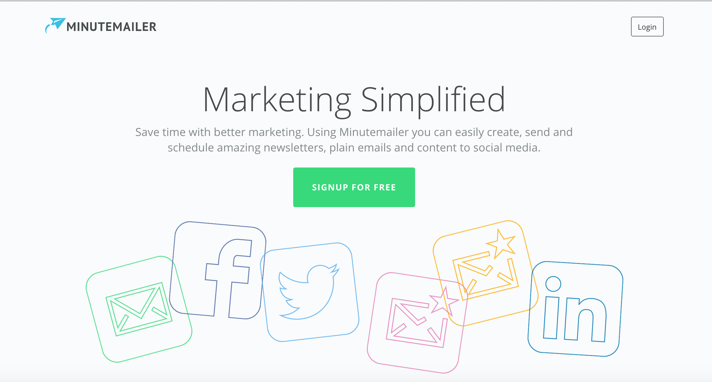
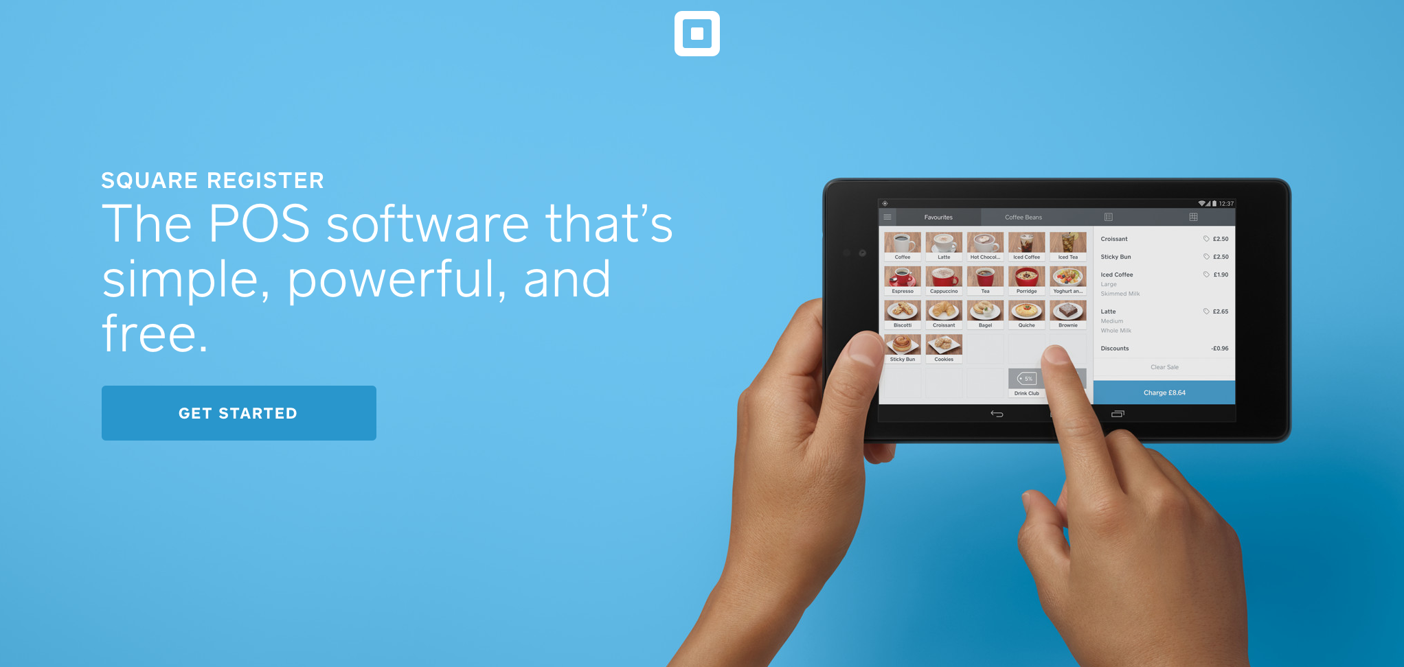
If you want to be inspired about your next landing page, here are some good examples we came across from many different fields.

These could serve as real-time examples for the tips above, while they are also offering the right creative direction for all the purposes a landing page may serve.

Screen Shot 2016-07-13 at 11.37.09

Screen Shot 2016-07-13 at 11.45.42 Screen Shot 2016-07-13 at 11.45.24 Screen Shot 2016-07-13 at 11.44.03 Screen Shot 2016-07-13 at 11.42.22 Screen Shot 2016-07-13 at 11.42.40 Screen Shot 2016-07-13 at 11.40.55 Screen Shot 2016-07-13 at 11.43.03


The article 11 quick UX tips to improve landing page conversion was first seen from https://searchenginewatch.com

How to increase your remarketing ad conversions in five steps

Remarketing adverts are designed to remind people who have visited your website of what you sell, as well as reinforcing your brand, when they’re moving around the web.

Remarketing is also known as retargeting and according to PPCMode’s Ultimate Guide for Retargeting, “Most sites are only able to convert 2% of their visitors on average. With retargeting however you’re able to keep the interest of the other 98%”.

By placing a cookie on an individual’s browser, companies can track their audience’s buying habits around the web and then create adverts targeted to their interests.

The two key reasons why remarketing works are:

Below we take a look at the five key factors your remarketing adverts need to have to ensure you’re harnessing every potential opportunity for a conversion.

1. Relevance

How relevant the products or service which is being remarketed to your audience is the most important aspect of a remarketing campaign.

By displaying highly targeted adverts, you are more likely to engage existing or potential customers so they click back to your website.

The simplest way to do this is to display the exact products your customer viewed on your website, in the remarketing banner.

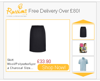
This is known as ‘dynamic remarketing’ and in this example from catering equipment specialists Russums, the exact products I viewed on the website are included in the advert in rotation, with a ‘shop now’ button to encourage me to click.

russums-dynamic-remarketing-example

Sometimes this goes a step further by showing customers who’ve abandoned their shopping cart what is in their cart and allowing them to continue to complete their order with one click.

You can set up different adverts for customers at different stages of the buying cycle. For example, once someone buys the product you have been remarketing to them, remove this item from the banner and replace it with a complementary product. If they bought a girl’s dress from you, for example, then show them a cardigan or matching shoes instead of the dress they already bought.

If a customer has already bought from you, then entice them back to buy more with a return customer discount, or alternatively, if a potential customer has viewed products on your website but not bought anything, then encourage them to convert with a new customer special offer.

Remember the golden rule of remarketing, the more targeted the advert, the higher the conversion rate.

2. Button it up

Calls to action on your banners provide the push which gets visitors to click on your advert and visit your website.

As the aim of call to action buttons are to get people to click and convert, the copy you use on them needs to be persuasive. Buttons with very specific instructions work particularly well as they tell an individual exactly what they need to do next.

For example, this banner from Coast gets straight to the point with a clear offer (60% off sale) and call to action (shop now).

coast-remarketing-example

The Financial Times banner advert has an equally direct call to action button of ‘Subscribe and save 25%’ clearly outlining what action an individual has to take and what benefit they’ll get when they take this action.

financial-times-remarketing-example

This small space of around five words is the place where you tell your audience what you want them to do, ‘find out more’, ‘download free guide’, ‘sign up free’, ‘book now’ are all persuasive messages.

The less ambiguity the better with call to action buttons so avoid vague prompts such as ‘go’ or ‘click here’ or just using arrows on your button.

Your click through rate can improve dramatically by adding a time sensitive offer as your call to action – limited free trials, discounts and early booking incentives create a sense of urgency which can encourage people to click.

Calls to action such as ‘buy now’ for expensive products don’t always work as this implies a commitment to an expensive purchase by clicking the button.

This Dunster House advert is an example of this, as more enticing and less direct copy on the button would be more appropriate as even if someone has viewed the cabins before, they are unlikely to just ‘buy now’ for such an expensive purchase. Calls to action such as ‘explore the range’ or ‘discover your perfect cabin’ would be better options.

dunster-house-remarketing-example

When it comes to colour – buttons which stand out work best for the obvious reason that they’re easier to see. The Coast button is a good example of this as the pink of the button contrasts perfectly with the pale background of the advert.

Text should be large and clear and there shouldn’t be too much of it in the box, a maximum of five words is a good rule of thumb to ensure your copy is informative and you’re not confusing or distracting people by trying to deliver too much information.

3. Timing is everything

Not everyone who visits your website will buy online from you as they may choose to buy direct either over the phone or in person.

Seeing an advert for something someone has already bought will be annoying for them and pointless for you, as they’re unlikely to buy the same item again online. Limit the number of times someone sees the same advert and instead show complementary products.

Your adverts will have your branding on them so they will be constantly reinforcing your message, meaning they will be more likely to remember your brand when they’re ready to buy again.

Bombarding an individual with the same advert over and over again is akin to harassing them, which could reflect badly on your brand. To find the sweet spot to cap your adverts at for your customers, test different lengths and see which brings in the best conversions.

In many cases, showing an individual an advert for an item they didn’t buy three months ago is too late, unless you specialise in products with a longer buying cycle such as vehicles or B2B services like software and insurance.

If you’re dealing with everyday items, remarketing a pair of shoes, for example, to someone three months after they originally viewed them on your website is probably going to be too late. You can change your adverts to show for a more appropriate length of time by amending the ‘membership duration’ tab in your Adwords campaign.

Depending on your business, you may have very specific busy periods throughout the year. For example, if an individual purchased flowers from an online florist for Valentine’s Day then it’s worth retargeting adverts to them around other special occasions such as Mother’s Day.

You could set up specific Dynamic remarketing campaigns with Google ads to help you keep track and market to people who have visited or bought from your store to reengage them the following year.

Time sensitive calls to action are another way to boost click through rates by utilising your advert buttons. Calls to action which encourage urgency give people a reason to act sooner rather than later and can therefore boost click through rates.

This advert from the Jockey Club promoting a family event at Sandown Park Racecourse includes a special ‘early bird’ offer of 20% off for advance bookings, as well as showing all the other information busy parents need to know about the event.

sandown-park-remarketing-example

4. The right design for the right audience

The tricky part of designing remarketing banners is that your design needs to reflect your brand whilst encouraging shoppers to click through and complete their purchase. Below are some considerations you’ll want to think about when designing your banners.

Static vs animated adverts

Whether you opt for static or animated adverts will largely depend on the message you want to convey and the design resources you have at your disposal.

A static advert is much easier to produce and upload to your search network, but it might not have the capacity to showcase your products or service in the way you wish, as it’s simply a single still advert, usually containing a logo, call to action button and an image.

It’s easier to tell a story and convey more complex messages with animated banner ads but it’s important to think about what your key message is though, as if it can be conveyed clearly with a static advert then designing a HTML 5 advert may not be worth it.

Again, this is why testing is so important!

Branding

Remarketing adverts should be clearly branded as the whole point of this type of marketing is to reengage with people who have already visited your website.

They are unlikely to reengage with your brand if they don’t recognise it. Often your company logo and colours will be enough for people to recognise your brand but also bear in mind how you want your brand to come across to customers.

Consider this advert for Jimmy Choo, this remarketing banner simply displays the brand name along with a scrollable selection of their products.

jimmy-choo-remarketing-example

This simplicity works with Jimmy Choo as it is a global, aspirational brand, which means if someone thinking of buying from them they’re likely to be aware of the brand and prepared to pay a significant amount for a high quality pair of shoes, so subtle, smart branding is all that’s required to successfully reflect the ethos of the brand.

Compare this with this advert from Argos which includes the logo, an image of the product, sale information and a ‘shop now’ button.

argos-remarketing-example

It’s much bolder, brighter and contains more information than the Jimmy Choo advert but again, it reflects the ethos of the Argos brand as an affordable retailer perfectly.

5. Optimise to boost conversions

As with a regular PPC campaign, you should constantly test your remarketing adverts to ensure they are optimised for conversions.

Split test your adverts to find out which ones are most effective at converting.

Some areas to consider testing include:

  • Calls to action copy, colours and button position
  • Different messages for people at different stages of the buying cycle, for example, ‘new stock’ adverts for existing customers
  • The number of times an advert is displayed for
  • The images on the advert
  • Static and animated adverts, or even just text only adverts

Vigorous testing is the only way you will know what type of remarketing adverts convert best for your brand.

Simple tweaks to your remarketing adverts can boost your conversions and ensure your brand message is conveyed to your existing and potential customers.

By focusing on relevance and streamlining your comparing through testing, the higher your conversion rate will be from your remarketing adverts.


The article How to increase your remarketing ad conversions in five steps was first seen from https://searchenginewatch.com

Wednesday, 13 July 2016

How a dedicated IP address and SSL certificate affects your search engine rankings

To get better search engine rankings or land on the first page results on Google in 2016, site speed and HTTPS were listed among the ranking factors.

Brian Dean of Backlinko conducted an experiment with 1 million Google results to determine which factors help web pages appear on the first SERP and I’ll be discussing two of those ranking factors here:

  1. Dedicated IP address – page or site’s speed
  2. SSL Certificate – HTTPS

1. How a dedicated IP address affects your search engine rankings

Every online business uses a hosting company and most of the time pay no attention to what kind of IP address was assigned to their hosting account, be it a “dedicated or shared hosting IP address.”

There are two types of IP addresses in the web hosting industry and they are:

  • Shared IP address: this means there are numerous websites sharing the same address. The hosting server determines which website is requested by the URL entered.
  • Dedicated IP address: this means a website has its own IP address. Typing in the URL of the website or its IP address would bring you to the same website.

Mind you, there are controversies around dedicated IP addresses for SEO and questions around whether a dedicated IP address would actually boost rankings.

The truth is, a dedicated IP address from your hosting company would not boost your SEO but increase website loading speed, which is a criterion for SEO (Google and Bing) in 2016.

So a dedicated IP can result in an increase in site’s speed which equals good SEO for your website.

Benefits of using a dedicated IP address

The benefits of using a dedicated IP address can be found below:

  • Having your own private SSL certificate: Google made having an SSL Certificate a ranking factor for websites looking to rank for keywords in Google search engine results. Google crawlers have been designed to index a site with the SSL certificate and favor websites using HTTPS.
  • Enhanced performance and security: for websites attracting huge web traffic, a dedicated IP address would be the best bet, as a shared hosting IP address would be used by thousands of other websites resulting in constant server crash and website downtime (my experience with Namecheap), making your website unreachable to visitors thereby losing SEO juice.

Key takeaway

Having a dedicated IP address for your hosting server would increase your website speed, provide enhanced performance and security (access to an SSL Certificate).

2. How an SSL certificate affects your search engine rankings

An SSL Certificate is required for ecommerce businesses and other online businesses collecting personal information from customers.

However to use an SSL certificate on your website you need a dedicated or static IP address.

What is an SSL certificate?

An SSL Certificate is a security token used to protect private information traveling across the web. It provides security for customers and builds trust on the business with the presence of the lock icon or green bar.

https padlock

Benefits of an SSL certificate

The benefits of using an SSL Certificate is not limited to SEO, an SSL Certificate provides security for the website owner and trust from the website visitors or customer.

  • Better Rankings In Google: On the 1st of April, 2011 Google announced they would be crawling, indexing and storing data on SSL certificates found on the web and on the 6th of August, 2014, security for web users was addressed by Google when they announced HTTPS as a ranking factor in search engine results.
  • Security: An SSL certificate protects your domain name and email from phishing scams. As a business, you don’t want anyone cloning your website to gain personal information but with a proper SSL Certificate, it would be hard for anyone to clone your website.
  • Encryption: Using an SSL certificate on your website encrypts sensitive information collected from your website visitors and customers intended for you only. The Internet consist of several computers and this can be breached but having an SSL Certificate encrypts information traveling across the web to the recipient.
  • Trust: According to a survey conducted by GlobalSign, 77% of website visitors worry that their personal data could be intercepted or misused online. Using an SSL Certificate with its lock icon or green bar would increase trust on your business as 29% of customers look for the green bar before making a purchase or releasing sensitive information. Increased trust leads to increase in sales and conversion.

Key takeaway

An SSL Certificate provides security through HTTPS for your customers and website which is a ranking factor for Google search engine resulting in better rankings in search engine results.

Conclusion

To get on the first page of Google’s search results depends on a lot of factors but you need a fast dedicated hosting server (John Stevens reviewed 27 hosting providers), an SSL certificate for security and trust for customers and search engines

Implementing any of the above should provide positive changes to your search engine traffic.


The article How a dedicated IP address and SSL certificate affects your search engine rankings was first seen from https://searchenginewatch.com