Friday, 29 April 2016

Five of the most interesting SEM news stories of the week

Welcome to our weekly round-up of all the latest news and research from around the world of search marketing and beyond.

This week we have loads of paid search stats and research and news on the latest madcap tinkering by Google.

Paid search: John Lewis and Amazon spend the most on UK home décor

They must have lovely homes. If you can get round all the boxes and fork-lifts.

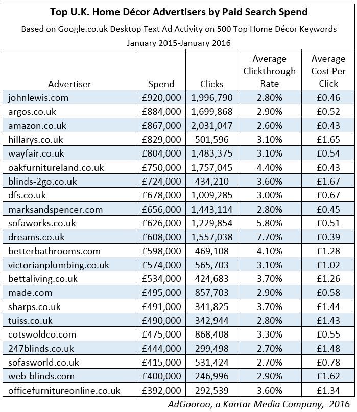
AdGooroo has published data on paid search advertising for the home décor category in the United Kingdom, examining 500 top, non-branded home décor keywords on Google between January 2015-January 2016.

Here are the stats:

  • 4,892 advertisers spent £45.5 million during the period.
  • Department store chain John Lewis led all advertisers with £920,000 spent, followed by Argos (£884,000) and Amazon (£867,000)
  • Amazon led all advertisers in clicks with 2 million during the period, just edging out John Lewis’s 1.99 million clicks
  • An average of 93 advertisers sponsored each of the top 20 keywords and 83 advertisers sponsored each of the 500 home décor keywords studied

UK-Home-Decor-Top-Advertisers

Summer vacation/Mother’s Day search stats from Yahoo

The last time I mentioned Mother’s Day coming soon, it brought about a panic on one side of the Atlantic. And now it’s time to do the same for the other side…

  • Mother’s Day is coming soon! And to celebrate Yahoo has released a report on consumer search insights revealing important trends about Mother’s Day shopping and summer travel plans. Let’s hope they also ordered some nice flowers too.
  • 1 in 6 shoppers plan to spend more money on this year’s gift, and they are open to trying new brands in order to find the perfect gift.
  • 52% of shoppers surveyed said that they will likely compare prices from multiple retailers on the same products before making a purchase.
  • DIY presents are becoming more popular. More than 15 million searches about Mother’s Day showed that consumers search search for “images,” “quotes,” “poems,” “cards,” and other creative ideas.
  • Online advertising was the top source for influencing family vacations and online ads are more influential than TV ads. When asked what motivated their travel decisions, more than 50% of family travellers said that online ads influenced them, while only 28% cited TV ads.
  • The most commonly used phrases searched in conjunction with summer vacation were beach, lake, park, island, and water. Specific destinations that were commonly searched include Colorado, France, Alaska, Maine, and Tahoe.
  • So far this year, the highest concentration of people searching “summer vacation” on Yahoo came from Illinois, Ohio, Michigan, Indiana, and Wisconsin.

50% of adults are unable to recognise ads in Google search results

As Graham Charlton reported this week, according to Ofcom half of all search engine using adults do not recognise ads.

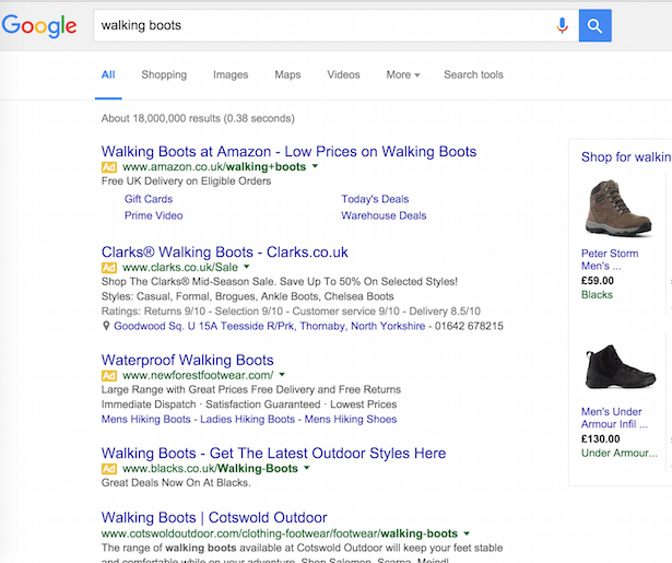
For the study, the respondents were shown a picture of the SERPs for ‘walking boots’ (please note this study took place in 2015)…

walking boots

The 1,328 survey respondents then had to select the results they thought were ‘paid for’. 60% identified them as paid links, while 49% identified them only as paid ads

ofcom 1

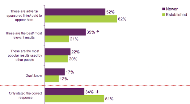
Ofcom also split the results out between newer and more established internet user and found that newer users were less likely to identify that the results with the yellow ad label were indeed paid results.

Google paid search positions #1 and #4 may lead to the highest CTR

As reported in MediaPost this week, Adobe has discovered that the cost per click for paid search ads served in the fourth position may produce the best outcome, with low cost-per-clicks but high click-through-rates.

CPCs rose slightly for the first and second paid search positions (6% and 7% up respectively) but fell for third and fourth (10% and 8%).

CTRs rose for all except the second position. First position was up 13%. Third: 2% and fourth: 18%.

So… how you going to optimise PPC ads for fourth position? Bearing in mind Google doesn’t always show a fourth paid search ad. Well I’ll leave you to that quandary and go put the kettle on.

Google’s In-Depth Articles disappeared, and are now back again

You may not have been aware of this but there’s an in-depth articles feature in Google that helps you surface longer more evergreen articles.

in-depth articles

Well there was until a couple of weeks ago when it mysteriously vanished, leading to much speculation as to whether it had been axed or not.

Only that’s all for nothing now, as it’s suddenly back again. Leading to new speculation that the whole thing was just a bug/glitch/mistake.

Now although this reads as a total non-event, your takeaway from this should be NEVER EVER take anything in search for granted, because Google will not only manually change an algorithm on purpose but occasionally lean on a keyboard and delete something vital by accident.


The article Five of the most interesting SEM news stories of the week was first seen from https://searchenginewatch.com

Dennis Publishing’s Paul Lomax on adblocking and ‘anti-ad zealots’

The growth of adblocker usage is one of the major problems affecting publishers today, as it has the potential to cut into ad revenues which many rely on. 

Paul Lomax is CTO and Head of Product Development at Dennis Publishing (founded by the great Felix Dennis), an independent group which publishes many different titles, online and offline.

We caught up with Paul to ask his views on the growth of adblocking and how Dennis Publishing will look to deal with this issue.

How much of an issue is adblocking for Dennis Publishing? 

Not insignificant but still very much in the minority. It varies hugely by market, with tech and younger brands affected more than say our automotive brands.

We have a fairly diverse portfolio, thankfully. Obviously we’re concerned the numbers may grow, so we’re not resting on our laurels. 

Will adblocking force some publishers to abandon ad revenue models in favour of other revenue streams, such as ecommerce? 

I think if other revenue models were viable enough to be a primary revenue stream, they’d already be in wider use. Ecommerce is far from being a new thing. There’s clearly opportunity to further diversify revenue steams, but that doesn’t mean abandoning ad revenue models which are still very strong.

Also, ecommerce (in the publishing sense, usually affiliate based) is not immune from ad-blocking in so far as many ad blockers stop affiliate cookies being dropped, which means the publisher won’t get paid for referrals.

Some publishers may diversify more drastically into real ecommerce, ie shipping products themselves rather than via partners. Dennis, for example, now sells cars and finance online having acquired buyacar.co.uk in November 2014.

buy car

It could be argued that poor usability (intrusive ads etc) from publishers has driven the rise of adblocking. Is it too late now to change tack on ad formats?

There’s an argument that Pandora’s Box has been opened and can never be closed – even if publishers clean up their sites, there will be enough bad sites out there for users to leave ad blockers on, and there are other concerns too (malware, privacy). There’ll always be an element of ‘I ad block because I can’.

Remember though that publishers don’t create the adverts – advertisers, agencies and ad-tech companies have all played their part in this. There’s a drive towards good ‘acceptable ad’ formats, although the fact it sometimes requires payment is of course controversial, but there’s an element of user backlash about ad blockers letting any ads through. Some blockers that allow no ads are springing up. There will always be anti-ad zealots, but they’re in the minority.

The problem is when this filters over to mainstream users who have more legitimate concerns and would be happy for some value exchange to take place. At the moment ad blockers are mostly indiscriminate. I think we need to improve ad formats, but that alone isn’t enough. 

You have been experimenting with ways to deal with adblocking. What do those experiments look like?

Like other publishers, we want to see whether our readers are happy to white list our sites, or if they’re more aggressively anti-advertising. There are also many questions about ad blockers’ ability to circumvent measures. And we want to look at discrepancies between various tracking and measurement methods.

We think solutions may vary depending on the brand and its market – for example a B2B IT website with pretty unique content might be in a better position to block users than say a news or more mass-market website.

And some of our brands may do a ‘data wall’, where we could ask for their contact details rather than require them to view advertising. More mass-market brands such as Coach might have more of a soft message, or an ad recovery solution. We’re open minded. 

What have you learnt from other publishers’ attempts at combating the negative impact of adblocking? Did you use them as a reference when designing your experiments?

I don’t think we’ve seen studies long enough to draw any conclusions. For example, the much publicised Forbes trial data ends the day before the Adblock Plus community added rules to circumvent their message.

This resulted in ad block users seeing the ‘thank you for whitelisting’ message but not actually seeing any ads. If you have an absolute ‘whitelist to view this site’ wall, then ad block developers are going to try and circumvent it – it becomes, to quote Sourcepoint, a knife fight. 

forbes adblock

Do you think that adblocking could be a blessing in disguise for publishers, who will be encouraged to consider their sites’ user experiences?

For users, maybe, for publishers, no, because of the largely indiscriminate nature of ad blockers. Let’s be clear, ad blockers aren’t all about users either – there are companies involved in ad blocking who are and will be making millions from the protection racket of pay to display.

It’s also a massive threat to net neutrality, if ISPs and mobile networks starting using technology like Shine, as has happened in Trinidad.  

I’ve heard of examples where mobile and other adblockers are blocking even native posts. Many imagine that adblockers target only popups and banners, but are there other consequences? 

People also think they only block third party content, eg ad-served, but they can block anything that can be pinned down via it’s HTML pattern (eg a CSS class name). All it takes is a user to right click on something they think is an ad for it to be reported to the community developers, who then figure out how to block it. And those creating the block lists tend to be anti-ad zealots.

They can and do block logos from sponsored blocks, any content or links labelled sponsored or similar (which given the ASA are starting to crack down on native labelling in the UK will become easier), anything they consider ‘annoying’.

Also things like related content blocks (if some of the items are paid-for), or newsletter sign up promos, or paywall notices. Ironically some even block cookie privacy notices. Many also have privacy options, which can stop affiliate or attribution tracking, retargeting, personalisation, ad effectiveness measurement, analytics (eg GA), A/B testing. The latter could have an impact on web professionals being able to optimise user experience or improve conversion rates. 


The article Dennis Publishing’s Paul Lomax on adblocking and ‘anti-ad zealots’ was first seen from https://searchenginewatch.com

Thursday, 28 April 2016

Taking your analytics practice to the next level

As both a Googler and ClickZ team member, I recently attended and participated in the always-inspirational ClickZ Live New York event.

Along with Katie Morse, Vice President, Social and Search at Nielsen and Pierce Crosby, business development and experienced data analyst at StockTwits, we had a panel discussion on how brands can take their analytics practice to the next level.

First, a quick description of the panel:

Data has become everyone’s domain, in all aspects of your marketing and business. Most companies do a good job at collecting and reporting data and have a basic process in place. But many are stuck as to what to do next to elevate value of data in their company.

As our conversation, and those questions the audience asked, were so good, I wanted to pull out some of the best questions and summary of answers we shared with attendees.

ClickZ NY analytics

Pierce, Katie, and Adam presenting at ClickZ Live NYC. Photo by Search Engine Watch columnist Thom Craver (used w/permission).

1. Most companies have varying groups that need access to analytics insights. How do you efficiently get them all what they need and how do you ensure it’s most useful for them?

The answer is process. Ensure that you have the right metrics delivered to the right people at an anticipated frequency. Also ensure that you have conducted proper resource allocation in order to allow time not just to share dashboards, but flesh out insights for your teams to take action on.

If you are just delivering dashboards without context, you’re not doing your job. Actually, you’re performing the job a script can do – which isn’t a good place to be.

The more formalized you can be with your processes, the better, as this will make you incredibly efficient and free up time for the creative, valuable (and fun!) analyst projects.

2. How do you see a breakdown of time spent on analytics between data capture, reporting, and analysis? What are the best ways to help get organizations to move up the value chain?

The more time you can spend on analysis, the better. But if you’re not capturing the right data and reporting it in an articulate way, your analysis won’t be accurate or defensible. That’s why it’s important to spend time up front on ensuring your data quality is excellent and you’re effortlessly generating beautiful reports.

Need some hard numbers to serve as a guideline? Aim for 10% of time spent on data capture, 20% on reporting, and 70% on analysis and delivering insights to your team (my previous ClickZ column goes over the reporting part in more detail).

The way to get an organization to move up the value chain is easy: trend down the time you spend on capture and reporting. It’ll happen organically.

3. Can you talk about how you are using data across tactics — such as how does search inform social, email or other areas of marketing?

Data should not exist in a silo. You should be using it to inform everything you do, and you should be using it to understand your users, not simply to fill in dashboards.

For example: if you notice visitors to your ecommerce site are frequently querying a product name or type you don’t have in site search, you should share this data with your product team and persuade them to offer it. Marketing isn’t just about promoting products anymore.

Marketing now needs to be involved in the actual strategic decisions companies make, and data is how we get a seat here. Our user data should be informing what we do next, not just showing successes of our sites and apps. This all starts with breaking down silos and using insights cross functionally – beyond marketing.

4. Let’s talk about goal setting: how you can quantify success outside of just ROI? What are some other metrics that we might want to take a look at?

ROI in dollar terms is great. Everyone can understand this, especially your CFO. But generating revenue is just one outcome from your marketing and content, and just one thing to optimize.

For example, if your call center or social CRM team notices a recurring question about your company’s product they have to answer repeatedly, that’s a huge opportunity. What you need to do in this type of situation is measure what your user’s problems are and use this information to power answers in an automated / self-service fashion such as an FAQ page on your site or chatbot.

Creating this type of content in a data-driven manner can help trend down easily answered questions, freeing up your customer service team to focus on tougher problems which require a human touch and making your customers happier by simply getting the information they need immediately. That’s a win-win: and very measurable!

5. What are some actionable ways or things we could all do to become better at analyzing the “what happened” and “why” at our metrics?

This is an area of practice makes perfect. The answer is to hire skilled leaders for your team that can inspire and grow your team’s analyst skills. But personal growth helps too: so attending events like ClickZ Live, trainings and courses (such as our Analytics Academy) and reading blogs and books (like Avinash’s definitive book, Web Analytics 2.0).

Although, there is simply no substitute for hands on experience at making data-drive decisions and becoming fluent in the world of digital measurement.

Working at an agency and on hundreds of clients across industries helped me get to where I am, so that’s a path I can personally recommend. Although there’s no reason you can’t build your skills in-house too.

To learn more about the changing face of digital marketing, come to our two-day Shift London event in May.


The article Taking your analytics practice to the next level was first seen from https://searchenginewatch.com

How to achieve face-melting content marketing ROI

Jason Miller knows a thing or two about content. He’s the Senior Content Marketing Manager at Linkedin, who presented a session titled “How to Achieve Face-Melting Content Marketing ROI” at ClickZ Live NY last week.

With that title, the session immediately piqued my interest and Jason did not disappoint.

In case you were wondering, face melting is:

“The condition in which, due to an extreme exposure to an event of epic awesomeness, horror or any other emotion on the more extreme end of the spectrum of emotions, one loses all perception of space and time including (but not limited to) a brief lapse in physical awareness. Such an emotional rush can even override Pain, which in some cases may be the cause of the rush.”

Source: The Urban Dictionary

To put this in context, you don’t need more content; you need more EPIC and AWESOME content – aka more relevant content.

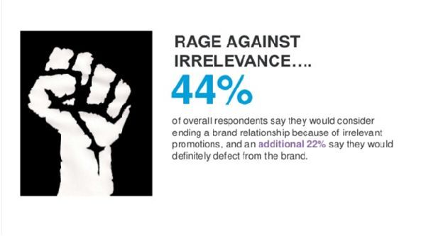
According to Jason, in a recent survey, 44% of overall respondents say they would consider ending a brand relationship because of irrelevant promotions. An additional 22%, say they would definitely defect from the brand.

Rage against irrelevance

Developing relevant content doesn’t need to be a difficult exercise. It doesn’t require any special tools or secret sauce. It all begins with having empathy with your prospects and customers. The formula looks like this:

Useful x Enjoyable x Inspired = Innovative Content ~ Ann Handley

The process begins with the creation of a piece of “Big Rock Content” Not a 2,000 word evergreen piece, but something closer to a 50 or 100 page ebook. Something Awesome. Something Epic. Something like The Sophisticated Marketers Guide to LinkedIn

Big, thick, juicy content is the gift that keeps on giving. A single piece of Big Rock content can be repurposed to attract links, generate traffic and build brand awareness for a year or more. Jason suggests thinking of it as something akin to Leftover Turkey.

leftover-turkey

If distracted by the turkey, this may be a better visual for you:

repurpose

Once your content is published, blast the news EVERYWHERE: Company pages, email, blog, sponsored updates, Display ads, SlideShare, PPC, Twitter, etc. Use turkey slices to fuel your content hubs.

Execution

It’s easy to develop a set of goals, but a plan is specific, time phased and measurable. After determining what constitutes your Big Rock & turkey slices, Jason gave an example of a five week rollout

  • Week 1: Publish Big Rock Content, Influencer Outreach, Sponsored Updates
  • Week 2: Big Rock Webinar, Influencer Outreach, Sponsored Updates
  • Week 3: Big Rock Webinar, Influencer Outreach, Sponsored Updates, Turkey Slice 1, Turkey Slice 2
  • Weeks 4 & 5: Big Rock Webinar, Influencer Outreach, Sponsored Updates, Turkey Slice 1, Turkey Slice 2, Turkey Slice 3, Turkey Slice 4

Your blog ties it all together

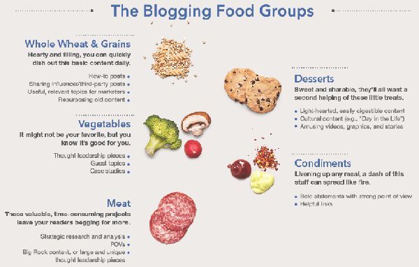
Sticking with his food analogy, Jason developed some Blogging Food Groups:

Blogging Food Groups

To be served up on the following schedule (with the associated time commitment)

  • Monday: Vegetables (35% time spent in development)
  • Tuesday: Meats (20% time spent in development)
  • Wednesday : Whole wheat & grains (25% time spent in development)
  • Thursday: Condiments (5% time spent in development)
  • Friday: Desserts (15% time spent in development)

The marketing team of the future

Jason may like his food, but he really loves Kiss.

He used the band as an analogy of how digital marketing symmetry works:

  • SEO – Lays the groundwork
  • Social – Fuels the content
  • Content – Fuels the demand

In the case of the band:

  • They consistently deliver content that their fans want to consume and share
  • Their PR efforts guide their vision as one of the hottest bands in the world
  • They deliver amazing experiences on tour (Event Marketing)
  • They built a thriving community

The Takeaway

Big Rock content isn’t something that would be nice to have. It’s something that you need. As Hummingbird, RankBrain and other algorithms get better; you need to become a smarter marketer. Following this approach to content marketing is sure to give you an edge over most competitors.

To learn more about the changing face of digital marketing, come to our two-day Shift London event in May.

Chuck Price is the founder of Measurable SEO and contributor to Search Engine Watch.


The article How to achieve face-melting content marketing ROI was first seen from https://searchenginewatch.com

11 extraordinary uses of Augmented Reality (AR)

Jess Butcher, the director and co-founder of augmented reality app Blippar, is speaking at our Shift London event in May, so to prepare for this occasion, we thought we’d get fully immersed in the world of AR.

Put simply, AR is the technology that superimposes computer generated imagery onto the real world when looked at through a portable device. But, as marketers have discovered, AR can be so much more.

AR has not only succeeded where QR codes failed, but it has quickly shut down any opinion that its technology is gimmicky. No longer is AR the stuff of ‘oh look at this funny animation protruding out of a cola can’. Now genuinely useful experiences can be achieved to help your customers, clients and service providers in a real-life practical way.

Let’s take a look at some of these experiences…

The first three examples are taken from Blippar’s own case studies:

Maybelline, L’Oreal

To promote a new line of nail polish, Maybelline ran print ads in several US magazines giving readers the unique opportunity to virtually try on the new range of colors.

maybelline

The average reader engaged for more than four minutes, and more than 10% of users shared the campaign on social media. The campaign also helped Maybelline predict which colors were trending each week.

Argos

Argos made its holiday catalogue shoppable with the Blippar app by letting readers ‘blipp’ the pages to instantly buy items. This led to 21,000 customers sharing the campaign on social media, and more than 929,000 interactions were recorded over 10 weeks.

argos

Coca-Cola & Spotify

Coca-Cola, turned its 250ml cans into portable interactive Spotify jukeboxes. Users could use their smartphone to listen to the top 50 UK songs at that moment on Spotify by holding a can up to the screen.

coke-540.jpg__450x0_q85_crop_subsampling-2_upscale

Healthcare

As TechRepublic reported in 2o15, AR is making itself incredibly useful in the healthcare industry. The following examples are taken from Brian Wassom’s talk at last year’s Augmented World Expo in Santa Clara:

ARnatomy

To replace the giant, unwieldy anatomy text books that all medical students have to leanr, ARnatomy uses AR to pinpoint exactly the type of bone being studied, revealing all of its information on screen and lets allows users the ability to manipulate a tangible skeletal model.

Vipaar

Vipaar is a video support solution whereby a remote surgeon could project his hands onto the display of a surgeon on site wearing AR enabled glases and point and guide the hands of the surgeon.

AccuVein

AccuVein’s Vinny Luciano states that 40% of IVs miss on the first attempt at finding a vein, so they invented a scanner that projects over skin and shows nurses and doctors where various veins, valves and bifurcations are in a patient’s body. This has been used on more than 10 million patients so far, and made finding a vein on the first attempt 3.5x more likely.

VA-ST Visor

The winner of the 2014 Google Impact Challenge was the VA-ST visor. These ‘smart specs’ are intended for use by people who are legally blind or partially sighted to help with every day tasks.

The software can be taught to recognise 3D objects and then identify them within a scene, this can help with finding lost items, navigating environments or mapping out familiar faces to aid recognition.

Current Studios’ MRI game

Getting a child to remain still for the length of an MRI can be very difficult, so Current Studios developed a tablet game for kids to play before the procedure, that measures their ability to lay still for extended periods of time. Doctors can see the child’s stats, and then determine whether they would need a general anesthetic.

The British Museum

Ben Davis covered five AR lessons from The British Museum in 2013, and it still stands as an excellent use-case.

A Gift for Athena helps Key Stage 2 (ages 7-11) children engage with the museum’s Parthenon gallery. It’s a simple uncluttered experience, that nevertheless provides deep learning opportunities thanks to a focus on narrative and puzzle-solving.

American Apparel

The in-store experience can be brought to digital life with AR. Here American Apparel uses it app to reveal tonnes of information on its products as well as showing customer reviews and providing the ability to buy the product online if it’s out of stock and to see it in ever available colour.

Pepsi

Pepsi brought some magic (and terror) to the streets of London in 2014 with its AR enabled billboard. While waiting for a bus, unwitting people would be able to see flying saucers, tigers and asteroids approaching them through the advert. Proving that AR doesn’t just have to be contained on a wearable or smartphone.

With 7.5 million views, this video is one of YouTube’s most watched advertising campaigns.

For lots more information on the changing realities of marketing, come to Shift London in May.


The article 11 extraordinary uses of Augmented Reality (AR) was first seen from https://searchenginewatch.com

Wednesday, 27 April 2016

17 fascinating stats about beacons and location marketing

Today we embark on our fifth weekly #ClickZChat, where the good people of SEW and ClickZ take to Twitter to discuss with our expert friends and followers a particularly burning digital marketing related issue.

For this week’s chat, we’ll be talking about location marketing, NFC, beacons, and their usefulness for marketers, so please join us at 12pm EST (5pm UK) on Wednesday 27 April.

As preparation for the discussion, I’ve pulled together as many stats relating to beacons as I could possibly find, many of which should provide fuel for the conversation and maybe aid your own location marketing strategy.

1) The value of in-store retail sales influenced by beacon-triggered messages in the United States in 2015 and 2016 was $4.1 billion.

2) In 2016, an extraordinary $40 billion increase is estimated. Statista suggests that beacon messages will trigger retail sales worth $44.4 billion in the US.

ibeacons

3) Men are more likely than women to make a purchase based on personalized advertising they saw on an in-store beacon or display.

4) Among responding male internet users aged between 18 and 34 years, 91% said they were influenced by personalized in-store advertising. Female internet users influenced by in-store beacon tech amounted to 76%.

ibeacons by gender

5) More than 42% of companies already have proximity marketing (such as beacons and geolocation) in place. 39% say they will implement it in the next three years. 18.6% say they have no plans for beacons.

6) The future plans for beacon technology integration is trailing in popularity behind online basket comparison (42%), in-store Wi-Fi (54.3%), scan-and-go (59.3%) in-store bookmarking (62.8%).

[Source: Statista]

7) 46% of retailers have launched beacon programs in 2015, up from 15% in 2014.

8) 71% retailers are able to track and understand customers’ buying patterns using beacons.

9) 65% feel they are able to target customers down to the aisle level.

10) 59% feel customers are more engaged in the store.

11) 53% retailers feel they are able to create more relevant and compelling offers in the store.

12) 24% retailers saw an increase in sales.

13) 24% retailers saw an increase in offer redemption,

[Source: Retail Touchpoints and reported by Beaconstac]

14) 82% of customers make purchase decisions in-store. [Google]

15) By 2018, the beacon installed base will consist of 4.5 million active beacons overall, with 3.5 million of these in use by retailers.

bii-beacons-installed-base-estimate-1

16) Half of the top 100 retailers in the US tested beacons in 2014, this was expected to increase to one-third of their store locations by the end of 2015.

17) Globally, it’s estimated that 570 million Android and Apple smartphones are compatible with Bluetooth low energy (BLE), the signal used by beacons to trigger smartphone apps. This is one-third of the smartphone installed base.

[Source: Business Insider]


The article 17 fascinating stats about beacons and location marketing was first seen from https://searchenginewatch.com

10 secret ingredients of a 10x marketer

What attributes make for a brilliant marketer?

Over the past few years there has been a lot of talk about marketers who punch well above their weight. For some, the term ‘growth hacker’ has described the type of marketer who with a mixture of tech and creativity can reach and convert large numbers of people at speed and low cost.

These types of marketers typically work at small startups, where a lack of barriers such as IT, organisational politics and the ‘brand police’ allows them to get stuff done.

But there’s also the type of marketer who can work comfortably with large and complex systems in legacy companies. These are the folks who can make sense out of millions of data points, tame large databases that have suffered from integration issues or a lack of governance. In addition to their superior productivity, they can also achieve levels of marketing measurement beyond anything that has been done before (for example, by instituting attribution models or accurate revenue forecasts in ways that surprise and delight the Chief Financial Officer).

There have been a few blog posts recently (for example from Scott Brinker) which have floated the concept of the 10x marketer – leading from the belief in the 10x engineer. In the run up to SHIFT, I wanted to suggest some attributes that I have seen in exceptional marketers over the past few years (caveat: the 10x is more of a borrowed term than actually a quantitative statement on their productivity).

I hope you’ll be able to add to the list in the comments below…

They understand the importance of structured data – and build marketing as such

With terms such as ‘big data’ still being used to large effect (so much so that it is one of the most expensive paid search keywords), it would be easy to think the days of structured databases are over. Wrong.

The majority of uses of data for marketing require it to be in a structured form. This is not only to create properly functioning campaigns, but also to make sure that systems can be properly integrated.

Data mapping isn’t the most glamorous of tasks, but sophisticated marketing tech stacks with multiple layers need the right data being passed through in the right way at the right time as a lot of the functionality that vendors sell depends on a particular way of structuring the data. It’s this which powers excellent cross-channel customer experiences.

They know vendor weaknesses and tech idiosyncrasies

Every single technology platform has its idiosyncrasies and weaknesses. Even when two products are apparently part of a single tech cloud, there are often significant limitations in how they can be successfully integrated or the caveats that come with the results and functionality they produce.

Not all marketing clouds have a silver lining

Many 10x marketers get involved when platforms just don’t work as they should, despite the promises of vendor sales and marketing messages.

They automate for the win

Superior marketing performance comes from creating excellent and profitable customer experiences in an automated fashion. This not only means their customers are receiving the right contact at the right time with the right message, but also that the day to day workload of the marketing team is seldom repetitive.

10x marketers will not only create automated marketing for their prospects and customers – they’ll also use tools like Zapier to automate reporting (for example, by sending data to a common Google Spreadsheet which then creates dashboards on a tool like Geckoboard).

They speak multiple business languages – finance, tech and operations

In order to build relationships and credibility internally, the 10x marketer knows what makes other departments tick.

Finance is the language that tends to rule in the boardroom. For this reason, the 10x marketer knows how to tie the effects of activity at the tactical level right down to the bottom line. For B2B marketers, they’ll know how their various campaigns perform on a cost per lead/opportunity/sale basis, and be able to tie activity from the first click through to the deal being closed won. For B2C marketers, they’ll know the impact of their campaigns not just on revenue, but also on margin, average order values and in-store sales.

To get stuff done, they need to communicate properly with their technical colleagues. This requires an understanding of how they work. 10x marketers don’t bother developers at their desks at random times or come with requirements that are unclear and wooly. They articulate the needs of internal and external users at an appropriate level of detail, are happy to defer to the expertise of the team and don’t make ridiculous demands.

For operations, they’ll likely not only know how they work – they’ll also have access to requisite systems for logistics and distribution. In areas such as ecommerce, knowing the logistical bottlenecks that cause your customers to have a sub-par experience is critical – otherwise key metrics such as Customer Lifetime Value can be sapped away.

They build great relationships – but don’t treat fools gladly

In order to make marketing efforts work, it seldom can be done by one person alone. That’s why the 10x marketer builds relationships internally and externally to get stuff done.

Internally, they get on the side of those they need buy in with. This is where the language skills (see above) really help.

Externally, they really get to know their agencies and suppliers, building solid relationships that mean both are willing to go the extra mile. But they are also quick to cut ties with those that weigh their company down.

They can measure their performance – but also know the grey area

Despite the hope for measurement nirvana, the reality is not everything can be accurately measured within marketing. However, it is possible to come close once measurement and integration is in place.

The 10x marketer will not only be able to present more performance data than the company has also seen – they will also be comfortable with the grey areas, caveats and ambiguities that naturally occur.

They take joy in creative optimisation

I’ve had some great laughs when running display campaigns testing a number of different variables. Examples I have really chuckled at include:

  • Testing the impact of a banana versus a hamburger on a B2B LinkedIn ad (result: hamburgers win, especially around lunchtime when the clickthrough rate soars).
  • Changing numbers in call to action text – resulting in large uplifts.
  • Using a hero image of someone on a brick background vs a white wall.

burger-vs-banana

One of my favourite case studies actually comes from Eat 24 (warning: NSFW) who achieved fantastic ROI for their food delivery by advertising on porn sites. It’s this type of creativity, freedom and fun that makes for great conversion rate optimisation.

blt-eat-24

They bring energy and urgency to their teams and colleagues

Top performing marketers don’t wait until tomorrow. They get things done now – and quickly. This sense of energy and speed rubs off on their colleagues, and the momentum can drive the entire organisation forwards.

If there are barriers, they knock them down or work around them with the same sense of pace. This means they are always generating results.

They really understand the customer

In mediocre marketing departments, the customer is relegated to either a generic persona put together a few years back by an external agency, or ignored altogether. The 10x marketer however has a deep understanding of what drives their customer, based on a rich set of data collected from numerous sources.

For example, they will know the unusual site search terms that bring colour to their personas. They can probably guess what newspapers they read or TV shows they watch. They know where and when they are engaging – whether during a lunch break at their desk, on their mobile during a commute, or on a tablet while in bed. All of this they will be able to tell by mixing their regular tools and measurement with a good dose of intuition and the odd third-party dataset.

They don’t stop learning

The world of digital doesn’t stop moving, and as such 10x marketers are always keen to get their hands on new tools or use existing ones in a different way. They know they can’t afford to rest on their laurels.

Are you a 10x marketer?

What do you think makes a 10x marketer? Do you recognise the characteristics above, or have I left something out? I look forward to reading your thoughts in the comments below…

If you think you are, or aspire to be, a 10x marketer, then attend SHIFT – brought to you by the experts at ClickZ and Search Engine Watch, taking place 24 – 25 May at 155 Bishopsgate, London.


The article 10 secret ingredients of a 10x marketer was first seen from https://searchenginewatch.com

Do 50% of adults really not recognise ads in search results?

Around half of adults are unable to recognise ads in Google’s search results, according to a survey. 

This surprising statistic comes from Ofcom’s Adults’ media use and attitudes report, released this month.

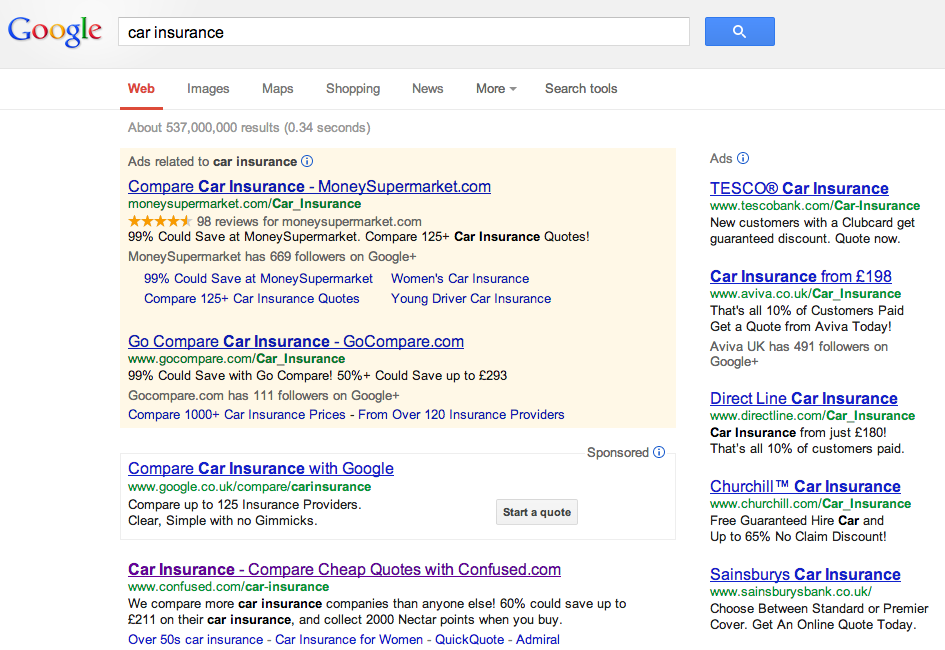
While I’ve seen studies suggesting that many people don’t know the difference between paid and organic ads, that 50% could look at a set of results like those below and still not spot them seems bizarre.

paid and organic results

The stats

For Ofcom’s study, ‘adults who use search engines’ were shown a picture of the SERPs for ‘walking boots’.

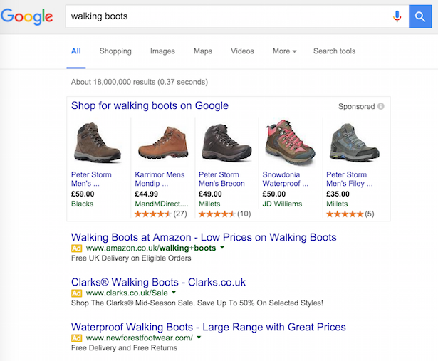
This is what the SERP looks like now, but the study was carried out in 2015, so the shopping results were not there at that time. As the study says:

“Their attention was drawn to the first three results at the top of the list, which were distinguished by an orange box with the word ‘Ad’ written in it. They were then prompted with three options and asked whether any of these applied to these first three results.”

walking boots

The 1,328 survey respondents were allowed to select more than one answer so, for example, some may have said that the ads were both paid links and the best results.

Understanding of paid-for results returned by Google searches, among adults who use search engine websites or apps:

ofcom 1

To clarify the results, 60% identified them as paid links, while 49% identified them only as paid ads, i.e. they selected only the correct answer.

Ofcom also split the results out between newer and more established internet users. Newer users in this case are defined as those who first went online less than five years ago. There were 160 newer users surveyed, and 1,113 older users.

These are the response to the same question as before, just split by old and new:

ofcom 2

In a nutshell: newer users were less likely to identify that the results with the yellow ad label were indeed paid results. 34% of newer and 51% of established users gave only the correct answer.

I asked Andrew GirdwoodHead of Media Technology at Cello Signal about the findings. He was pretty surprised: 

“I’ve closely followed the evolution of disclosure in search engine ads over the years. At one point the lines were blurred – Yahoo’s paid inclusion, for example, traded your money with for some sort of organic search position. Those days, in Europe and America, are long gone. Regulators on both sides of the Atlantic watch closely.

The ad badge updates to Google’s paid search should have made it crystal clear the listing has been paid for. We’re talking about a bright yellow “Ad” label beside the result. How can you miss it? Searching for competitive keyword? Google returns a whole column of Ad, Ad, Ad and Ad mentions. It leaps off the badge to me.

It is just short of mind boggling that 50% of searchers in the UK can’t see the Ad disclosure. When Steve Krug published “Don’t Make Me Think” in 2000 to offer advice on web usability I wonder if he had imaged an audience that was both digitally savvy and web-blind as this.”

Other studies into PPC ads

I’ve looked at this issues before. In 2014, I reported on stats from UX firm Bunnyfoot, which found that 36% didn’t know that PPC ads were indeed ads (a previous study from the same firm produced a figure of 41%).

This was a relatively small sample – 103 people took UX tests with eye-tracking technology and were asked afterwards if they saw any ads.

With the help of Dan Barker, I carried out further tests on this using two separate polls of more than 2,000 UK internet users in total. We asked:

  1. Are people aware of the existence of ads on Google Search?
  2. Do they believe they click Google ads? And, if so, how frequently?

The results were very different to Ofcom’s, with just around 10% not seeing ads in Google results.

However, the very presence of the word ‘ad’ in the question perhaps implied to respondents that there are ads on Google, and gave them a clue about the answer.

There was another study by Varn earlier this year which produced a similar answer to that from Ofcom.

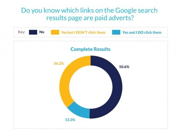
This time, 1,010 Uk internet users were asked the following question. 50.6% couldn’t identify ads:

varn-blog-stats-main

It is tricky to devise the perfect test for this issue. If you ask users questions, there is the obvious temptation for them to second-guess the answer and say what they think is the right answer, rather than just answering honestly.

The Ofcom test, showing users the results and asking the question seems sound enough to me. Also, that several different studies have found a reasonably high percentage of people not recognising ads, so I can only conclude that there’s something in this.

Why can’t people see the ads?

This is the big question. As someone who has worked in digital for more than 10 years, it’s hard to imagine.

After all, there’s a pretty clear yellow ad label next to the results. You can hardly accuse Google of not disclosing the nature of the link.

However, Google has taken steps which some would interpret as reducing the visibility of ads. Remember, Google has an interest in increasing the number of clicks on its ads.

For example, PPC ads used to be shaded until a couple of years ago, though there were no ad labels.

PPC ads shaded

Recently, Google has experimented with green ad labels. The reason is unclear, but it could be a way to help the ad label blend in with the URL text. Or it could simply be one of a series of experiments to find the best performing format.

green ad labels

I suspect this is a similar thing to banner blindness, in which people have just become immune to, or have learned to ignore the elements on the page that don’t interest them.

Indeed, plenty of eye-tracking studies have shown that users will simply not look at certain elements on a page. Could it be that users are looking at the top results and simply not seeing (or processing) the ‘ad’ label?

Whatever the reason, and whatever the exact proportion of search users who don’t recognise ads in Google, it seems clear that there is an issue here.


The article Do 50% of adults really not recognise ads in search results? was first seen from https://searchenginewatch.com

Tuesday, 26 April 2016

Beyond local SEO: Greg Gifford on how to win the visibility race

Last Friday at a packed-out Brighton SEO conference, expert local search consultant Greg Gifford delivered a fast and furious presentation on the secrets of local marketing visibility: it’s not just about local SEO.

In a slide-show brimming with references to classic car movies, Greg Gifford raced through a host of tips and tricks that can massively improve your business’s local visibility and let you storm ahead of the competition.

The days of “just having a website” and trying to make it rank near the top are over; it takes more than just SEO to market to local customers. That’s not to say that local SEO isn’t important, of course, but it shouldn’t be your only consideration.
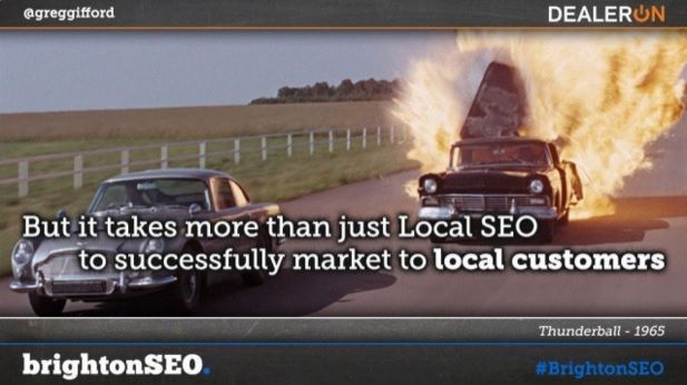
A still from the 1965 film 'Thunderball' showing two black cars on the road, one of which is exploding. The text in white reads, "But it takes more than just Local SEO to successfully market to local customers."

By thinking about local SEO as just one part of a wider visibility strategy, you can ensure that your business has a presence across multiple channels, not just in search. That’s better for your customers as well as for you.

In his talk, Gifford gave a run-down of other key areas to pay attention to, and how to optimise each one to target exactly the local audience you want to attract.

But first, because search is still hugely important for a local business, here are some handy tricks that Greg Gifford shared which will help you get ahead in the SEO game.

Quick tips for local SEO

Future-proof your SEO tactics

You only need to look at pizza delivery for an example of how much weight local visibility now carries in search, more than ever before. If you Google “pizza delivery”, even without specifying a location, Google will serve you local results – whether you asked for them or not.

Any algorithm changes that Google makes to its local search results have the potential to shake things up hugely, and the businesses who adapt fastest are often those who end up on top.

Google’s ‘Pigeon’ update in 2014 was a massive game-changer for local SEO, and mobile-oriented ranking changes like Mobilegeddon can have a huge impact on local given that 94% of mobile searches have local intent.
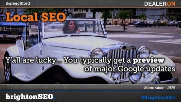
A slide from Greg Gifford's presentation featuring a still from 'Moonraker' with a woman driving a white car. The text reads, "Y'all are lucky... you typically get a preview of major Google updates."

But if you live outside the US, you’re in luck (for once!): Google algorithm updates always hit the US before they roll out anywhere else, so by keeping an eye on what’s happening in the States, you can ‘future-proof’ your SEO tactics and know exactly what to do by the time the update comes to you.

And even if you live in the US, there’s still a way you can get ahead: Gifford recommends keeping an eye on Moz.com’s local search ranking factors research, an extensive survey conducted across SEO experts analysing the changes in ranking factors they have observed over the past year. This will give you the low-down on what changes search experts sense in the winds and how they recommend dealing with them.

Make your blog a local destination

Maintaining a blog is still an excellent content and SEO strategy, giving businesses a platform to publish regular, fresh and insightful content and build a relationship with their visitors.

But in the words of Greg Gifford, “Don’t just market your shit!” Make your blog a local destination; share all sorts of things that people want to read.
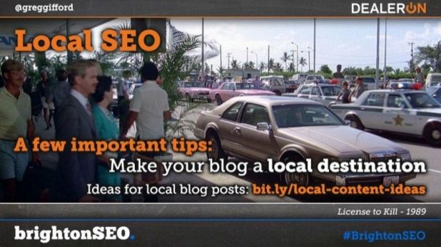
A slide featuring a still from the 1989 film 'License to Kill' with the words "A few important tips" in orange and then in white, "Make your blog a local destination". Below it is a URL to visit for ideas for local blog posts: bit.ly/local-content-ideas

Visitors will be turned off by a blog that is clearly just another mouthpiece for the company to promote its products. By thoughtfully curating all sorts of valuable local content, you can turn your blog into a go-to destination, boost its visibility and build relationships and links with other local blogs and businesses.

And speaking of local businesses…

Get those local business links!

When it comes to inbound links to your website, businesses will fight tooth and nail to try and get links from sites with the most domain authority. But Greg Gifford’s tip is one that many businesses wouldn’t even consider: go after “crappy little church websites”. You know the ones, with Microsoft Word clipart and neon green Comic Sans font in the header.

These kinds of tiny hyper-local websites have a huge amount of local relevance, and so their links carry a lot of weight. Best of all, none of your competitors will be going after them, so you can snap them up and enjoy the boost.

A photograph of a village church with a tower and a spire, underneath a blue sky and surrounded by trees and gravestones.Increase your local SEO with inbound links from highly hyperlocal websites – even if they aren’t always of the best quality. Photo by Lincolnian, made available via CC BY-SA 2.0

Build ‘local silos’ to show up in nearby cities

If you want your site to show up in search for a city you’re not located in, Gifford recommends building what he calls ‘local silos’ targeted at nearby cities.

A silo is the name given to a system or sector that operates in isolation from others. You’ve probably heard a lot about we should be breaking down silos, but in this case, they can work to your advantage.

To build ‘local silos’, create little self-contained zones of information within your site that are based around the city or neighbourhood you want to target and optimise the heck out of them.

Publish blog posts about that city, get links back from local businesses, and make sure they point to pages within the silo; and before too long, you’ll see your silos start to rank in local searches for that area.

A photograph showing a row of grey silos against a blue sky, with hay bales piled at the foot of each.Building silos can be a good thing, when it comes to local SEO. Photograph by Doc Searls, made available via CC BY 2.0.

Track your Google My Business clicks

In the midst of all the cool local SEO hacks, it pays to remember the basics, like making sure your business is listed on Google My Business and your profile is complete.

Gifford also advises adding tracking parameters to your Google My Business links in order to monitor the traffic coming to your site via that page. Local SEO Guide has a good guide on how to do this with Google’s URL builder tool.

It’s also worth keeping an eye on developments with Google Posts, which Google seems to be prepping as a significant platform for business promotion, and which could possibly be the next major development in local search if Google rolls it out on a larger scale.

How to optimise your email marketing

So we’ve covered the ‘local SEO’ part of local visibility; how about the ‘beyond’? Greg Gifford’s first tip might seem a little old-school, but it’s still one of the most effective marketing tools at your disposal: email marketing.

Gifford advises making sure that you’re using a responsive email design. Brands who have fully embraced responsive emails see 55% more Clicks to Open (CTO) from mobile and 23% more from desktop compared to brands who haven’t, according to research by Yesmail.

A still from 'Fast & Furious' with Email Marketing at the top in orange text, and then in white, "Adding a video to an email results in up to a 300% increase in CTR." Below is a link to read more about videos in email: bit.ly/email-with-video

Adding video to your emails can increase their attractiveness and interactivity, and a survey conducted by Forrester Marketing Group found that including a video in email marketing increased Click-Through Rate by 200 to 300%.

That statistic is from 2010, but more recent statistics have shown that just including the word “video” in an email subject line can raise open rates by 19% and Click-Through Rates by 65%.

Having a carefully curated list of email addresses to target can also come in handy when using Facebook Ads, as we’ll see later on.

Go beyond YouTube

If you’re going to commit to using video in your marketing strategy, Gifford has one key recommendation for you: don’t use YouTube. Instead, the video hosting service that Gifford recommends for keeping control of your content and tracking the important metrics is Wistia.

A still from the 1970 film 'Five Easy Pieces' showing a man who appears to be having an argument with a dog through a car window. The header at the top reads, "Videos" in orange. Below it, "Use Wistia to host your videos" is written in white. At the bottom it reads, "The ONLY choice for video hosting: www.wistia.com"

Here are some of the reasons he lists for opting for Wistia instead of YouTube or another major video host:

  • Wistia provides detailed video analytics, including engagement statistics, trend graphs, and individual viewer ‘heatmaps’ which show the parts of a video each user watched, skipped and rewatched.
  • You can tie user information to email addresses, and also use Wistia’s ‘Turnstile’ tool to add a form that requires users to input their email address at any point before, after or during the video.
  • Wistia allows you to give your videos a custom play button, which according to Wikia’s former Director of Growth and Acquisition Casey Henry can increase your play rate by 19%.
  • Similarly, you can also add a custom thumbnail to your videos, which can potentially boost your play rate by as much as 35% (and often winds up looking much nicer).
  • Wistia embeds on Facebook play in the news feed, and on Twitter will expand into a Twitter card that also allows users to play them in-stream.

Facebook ads

“Facebook ads used to be the drunk guy that showed up late to the party; now, they’re the cool guy that everyone’s stoked to see,” says Gifford. And if you’re looking to gain local visibility, Facebook ads have a lot of valuable advantages.

  • Facebook’s demographic targeting is incredibly diverse and exact, allowing you to target users based on location, age, gender, interests, and some mind-bogglingly specific parameters like education level, device and mobile connection.
  • You can also load in email lists and use them to create a custom audience of Facebook users who have accounts registered with those addresses.
  • Facebook also allows you to create Lookalike Audiences which will target new groups of people who are similar to audiences you’re already targeting.
  • Facebook’s ‘local awareness ads’ are an incredibly powerful local advertising tool. Google research on local search showed that roughly 70% of users want ads customised to their city or zip code, and between 60 and 70% want ads customised to their immediate surroundings.

Facebook’s local awareness ads allow you to drop a pin on any point on a map, and ads will be shown on mobile devices within a certain radius of that point. Try dropping a map pin on your competitors, on an event or at a conference!

A still from the 1989 film 'Back to the Future Part II', showing a flying DeLorean in the rain, with the text "Facebook awareness ads are awesome!" across it.

Use Beacons

Gifford’s final hot tip for local visibility is to use Beacons. Beacons are “small, Bluetooth-enabled hardware devices that can be installed in physical locations, like retail stores. They silently broadcast a message to any Bluetooth-enabled devices in their proximity, kind of like a lighthouse with text”, as Dan Cristo writes.

Usually Beacons require a dedicated app to work, but Beacon providers have begun setting up app networks which will allow Beacons to pop up a message on someone’s phone as long as any app in the network is running.

A still from the 2014 film 'The Wolf of Wall Street' showing a man lying on the ground and clinging on to a car with one hand. The text in white reads, "We had a beacon in our booth at a recent conference, and tagged 687 unique users!"

The apps are location-aware, so they can be tagged by the Beacon even if they aren’t running. You can then connect directly to Facebook’s API, allowing you to retarget ads at actual foot traffic.

DealerOn, Gifford’s marketing and advertising company, ran some tests with Beacon and found they led to anything from a 34.6% to a 45.7% increase in Click-Through Rate on ads. At a recent conference, the Beacon at DealerOn’s booth tagged 687 unique users.

Beacons are still an emerging technology, but they have the power to improve the customer experience and potentially revolutionise search – especially in a hyperlocal context. So watch out for opportunities and get creative with how you use them.


The article Beyond local SEO: Greg Gifford on how to win the visibility race was first seen from https://searchenginewatch.com
The convergence of SEO and UI goals for mobile users

One year after Google put an algorithmic premium on mobile experience, the so-called “Mobilegeddon,” Google is at it again. New tools are coming in late spring to help webmasters make their websites work better on mobile devices.

Mobilegeddon was the consequence of businesses not making their websites easier to use on smartphones and other mobile devices. Google’s updates were an incentive to reward webmasters by ranking mobile-friendly websites higher in search results.

/IMG/259/307259/mobilefriendly-articleembed-370x229

However, there was fallout: webmasters without mobile optimized sites saw as much as a 12% plunge in traffic to non-mobile sites, according to an Adobe study in July 2015.

Small businesses in particular suffered because only a third of such businesses had a mobile optimized website, according to eMarketer.

Google must focus on mobile because more than half of all Google searches are from smartphones and mobile devices. If consumers do not have a good experience when they click on a mobile SERP link, they will likely leave the page (and Google).

Specifically, a Google survey from late 2015 reported a loss of 29% of smartphone users if a site doesn’t satisfy their needs (lack of information or slower load times).

Furthermore, studies show that even a one second increase in load time can lead to an 11% decrease in page views, a 7% decrease in conversions and a 16% decrease in satisfaction.

Mobile-optimized sites are now central to a satisfying web experience.

So as the trend towards mobile continues, there are two reasons why businesses want to optimize their websites for mobile devices: superior customer experience and search engine ranking – and in fact, both are interconnected.

When Google rolled out Panda in 2011, they forever shifted algorithmic signal to include both relevance and quality. Therefore, without a superior customer experience (read: good UI), Google will not give a website a shot at a top SERP ranking and, in turn, high search results won’t result in increased user engagement.

But, mobile Information Architecture (IA) and User Interface (UI) is hard. Because of their mobility, small screen size and cumbersome keyboard entry, consumers interact with mobile devices in an entirely different way than with laptops or desktops and in a different context.

Mobile users do not have patience for anything that’s short of being intuitive, relevant and fast.

google mobile

Making your web page play nice across multiple devices, which has come to be labeled “responsive web design” means that you can use one URL that will adjust to whatever device it’s being used on.

Many websites still require horizontal scrolling or zoom on mobile, and layouts should be viewable on mobile without these shortcomings to the user experience. Responsive pages that can be viewed with ease on a desktop PC, tablet or smartphone are critical to making your webpage stickier for mobile users as well as saving on the cost of developing separate sites for multiple devices.

responsive design

Google is not, however, throwing businesses under the bus. The new tools will allow businesses to enter their website URL to get a diagnostic check to explain why their website isn’t mobile-friendly as well as how to improve the site. The time is (past) if you weren’t pro-active ensuring your site is mobile-friendly – stop everything and call a mobile savvy partner to make it so.

The good news is that brands that invest in mobile optimization and mobile strategies will crush the competition. If there is one unifying theme across all demographics, millennials in particular, it is the pervasive use of mobile devices to research and shop.

In fact, 93% of people who use a mobile device for research make a purchase and according to internal ConsumerAffairs user data, mobile visitors purchase within 2-4 hours compared to 1-3 days for desktop visitors.

Any user interface should be developed considering the way users engage with their mobile devices. Hold it in your hand, and walk through some of the sites you frequent on mobile. Ask yourself these questions:

  • How long does it take the site to load?
  • How do your hands engage with the site?
  • Are you needing to scroll far to get info?
  • Do you have trouble navigating to the point of a form fill or purchase?
  • Is it easy to click and call the business?
  • Where are menu items placed on the mobile UI, and where does your hand align with those menu items and calls to action?

Evaluate your customer journey pathways and imagine what your UI could do to give a smoother experience to mobile users.

To make sure you are converting web visits to sales, a mobile-friendly website must have print that is big enough to read without having to constantly pinch and zoom; tasks need to be simplified; links need to be clearly visible and spaced far enough apart so that errant clicks don’t occur.

For example, we love the way Flipboard’s user interface aligns with their business objectives. Flipboard gives people a single place to follow all of their interests and then save or share stories, images, and videos into their own Flipboard magazines. To that end, their mobile site is fast, simple and intuitive. The reward? 82 million monthly readers.

flipboard

To compete for mobile customers and higher search engine rankings, marketers must become mobile UI architects to design a more intuitive and relevant customer experience. Mobile is no longer the alternate platform, it is now the platform of choice.

Mobile devices are the new norm. We do everything on them from making dinner reservations, finding a date, managing our bank accounts, to hailing a ride. Mobile has changed the very foundation of how consumers communicate, connect, and discover online.

Not surprisingly, consumers expect brands to provide a superior mobile experience.

Zac Carman is CEO of ConsumerAffairs and contributor to Search Engine Watch.


The article The convergence of SEO and UI goals for mobile users was first seen from https://searchenginewatch.com

What’s the difference between responsive, adaptive and mobile-friendly sites?

Mobile adaptive sites and mobile responsive sights are the same, and both are synonyms for mobile-friendly… right? Not quite. Here’s a breakdown of the differences.

Last year, Google shook up the industry by switching up its mobile search algorithm to favor mobile-friendly sites. A fairly self-explanatory term, “mobile-friendly” refers to, well, a site that works on the smaller screen of a mobile device.

Mobilegeddon was a natural response to the natural shift in people’s browsing preferences, which are increasingly moving toward mobile devices. In an uncharacteristically transparent move, Google let everyone know about the update nearly two months ahead of time, even including tips for increased mobile-friendliness: avoiding software like Flash, which isn’t common on mobile devices; text that’s big enough to be read without zooming; links and buttons spaced far enough apart to accommodate fingers.

But while it’s clear what constitutes a mobile-friendly site, there’s still a level of confusion around what makes a mobile-friendly site different from a mobile responsive site, and what makes that one different from a mobile adaptive site.

Friendly vs. Responsive

Mobile-friendly sites aren’t necessarily designed specifically for a mobile device. Rather, they’re versions of sites that work across different devices. Think of a mobile-friendly site as mobile-optimized, whereas a responsive site is mobile-first.

A site that’s mobile responsive changes – or responds – based on the device it’s viewed on. For example, a desktop site may have a multi-column layout, which a mobile-friendly site may have on a smaller scale so users can see everything without having to scroll. But a mobile responsive site will have a single-column layout that translates better to the smaller screen.

See how Spirit Airlines’ mobile website is just a smaller version of the desktop site?

spirit-desktopp

spirit-mobile

Contrast that with H&M, whose mobile site is completely different. The desktop site’s layout wouldn’t translate to mobile very well. On a smaller screen, those six tabs across the top would either be visually overwhelming or too small to read.

hm-desktop

hm-mobile

Responsive sites have many of the same characteristics that make a site mobile-friendly, such as having the right kind of navigable spacing. But they differ in key ways. Responsive sites are reliant on mobile operating systems, in addition to having dynamic content that changes depending on where it’s viewed.

In other words, every responsive site is mobile-friendly. But not every mobile site is responsive. If you want to test a site’s responsiveness without having to look it up on multiple devices, simply change the size of your browser to see if the site alters itself.

To keep the Spirit and H&M examples going, I looked at both sites on my browser before making it narrower. I made it so much narrower that it’d be impossible for either site to fit perfectly, but notice how the tabs along the top of H&M’s kept getting closer together so they all fit. And speaking of tabs, yes, I know I hoard them and that I should be using the OneTab extension.

spirit-responsive

hm-responsiev

Responsive vs. adaptive

Mobile responsive and mobile adaptive sites are similar in theory, but different in practice. Both change their dimensions based on the browser and device where they’re being viewed.

Responsive sites adjust to any layout. Adaptive sites, on the other hand, only adapt at select points. The webmasters behind those want to ensure that the browser is a certain width, and the content will snap into place, rather than fluidly change sizes. In other words, an adaptive website has several different layouts, which can be deployed based on the size of the browser.

This GIF from Froont, a Latvian startup specializing in responsive web design, illustrates the difference perfectly:

gif-responsive-adaptiev

Steve Madden is an example of a brand with an adaptive site. Log onto the retailer’s website from your desktop and change the size of your browser.

Here it is, when my browser is at the normal width:

steve-madden-adaptive1

Here, my browser is a little narrower. See how some of the tabs disappear, but the logo looks the same? steve-madden-adaptive2

And now at this new width, the font has readjusted its size. Look at how much bigger the logo is.

steve-madden-adaptive3

Which one is best for me?

At this point, everyone should have a mobile-friendly site. Not everyone necessarily needs a site that’s mobile adaptive or responsive, but you probably should, if a significant portion of your traffic comes from mobile devices.

Adaptive is easier and significantly cheaper to deploy. Since the images are scaled down, rather than resized, adaptive sites often load faster, too.

But if your site is complex, you should think about going the responsive route, particularly if you have ecommerce offerings. Look at H&M’s desktop site; there are so many different things you can click on that it’d risk looking too busy on a smaller screen.

You should also have a mobile responsive site if your website features articles telling people to make their sites mobile responsive, obviously.

clickz-mobile-site


The article What’s the difference between responsive, adaptive and mobile-friendly sites? was first seen from https://searchenginewatch.com