In which we take a look at the experience of searching for a brand or product, looking at a brand’s organic and paid search reach and its subsequent landing page. All from the point of view of the customer.
This week let’s take a look at UK supermarkets.
How loyal are we to our regular supermarket?
First of all, I’d like to answer one related question: Just how loyal are people to their regularly used supermarket?
I used to live in Leytonstone, and despite my liberal pro independent-retailer leaning wooliness, my wife and I used to shop at Tesco. Why? Because it was the nearest. That’s all. Just pure laziness disguised as brand loyalty.
Now we’ve moved further east, we no longer have a supermarket within walking distance to frequent. So we decided to brave the world of online grocery shopping. After all with home delivery, you’re no longer tied down to such trifling matters as distance, opening hours and having to change out of your pyjamas.
After some moderate research, we picked Ocado, and we’ve been getting our weekly online shop from the Waitress affiliated service ever since. And do you know why we chose Ocado? Because they offered us a £30 off our first shop and because all our settings, personal details, payment details and previously bought items were saved with them, we couldn’t be bothered to switch. Again, laziness disguised as brand loyalty.
But, there is one other very important thing at play here: Ocado’s customer service was very good. Or should I say, not so bad that it made us go through the rigmarole of signing up to another supermarket.
We even abandoned our Tesco Clubcard and all its totted up, vaguely meaningless points, which we thought we cared about… but it turns out we don’t.
And this lack of loyalty is reflected around the UK. According to The Grocer 40% of families with children under the age of 10 have switched supermarkets in the last year.
The main reason for the switch is down to cheaper prices (42%) the second is the promise of a better loyalty scheme elsewhere (36%).
In terms of price, it’s an increasingly level playing field. With many stores offering price-matching and competitor aware discounts, gone are the days when you would consider one to be cheaper than the other (I’m referring to the bigger brands here, rather than Aldi or Lidl).
And again, with distance and opening hours meaningless, if one was to make the leap to online shopping, there’s very little reason why you would necessarily stick with the digital version of your previously favoured bricks and mortar store.
So this means that supermarkets have to differentiate in different ways, and not to hammer home a point that you will have heard many times on this site already, that differentiator is customer experience. How is a supermarket going to make it as pleasurable and convenient as possible to shop with them?
Make sure your website is as easy to use and navigate as possible, have a super quick checkout process, add your customer’s purchased items automatically into a favourites list that’s simple to edit, offer a wealth of delivery options and times, and stick to them!
Great customer service can be invisible; working behind the scenes to retain a person’s loyalty. But in order to be even get to that point, a supermarket has to cut through the competition with as much visibility as possible…
And of course this begins where almost every online journey begins…
Search
Let’s assume you’re brand new to online grocery shopping and you’re taking your first steps to find out which supermarket is for you. What do you type into the search box?
Well using a little keyword research I’ve found a few popular terms. Let’s start with…
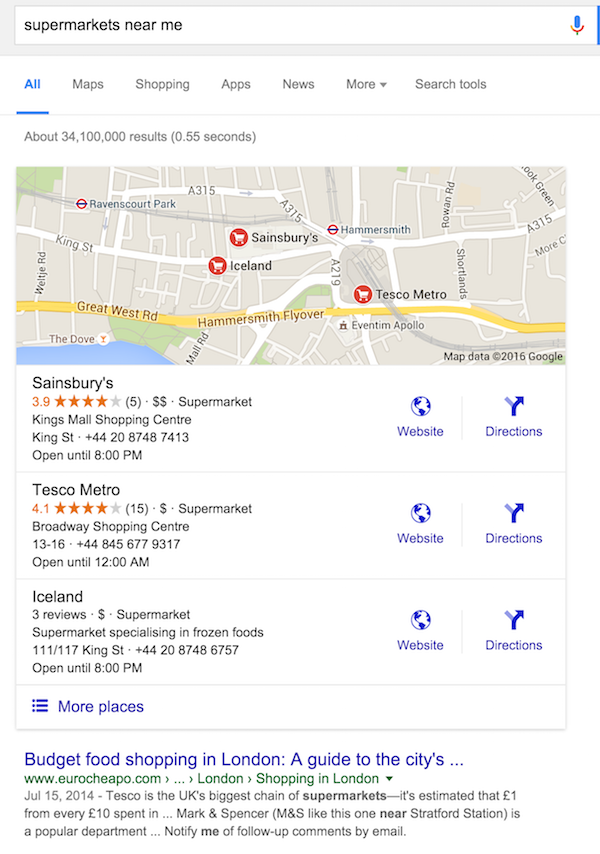
‘supermarkets near me’
If you’re searching for an online grocery experience, you’re probably not going to look for ‘supermarkets near me’, but the search term has an average of 18,000 monthly searches so it’s definitely a query to optimise for.
A supermarket won’t have much control over this SERP when it comes to organic results, save for making sure its Google My Business page is up to date with local opening hours and location. This is certainly important for smaller grocers who wish to be seen next to the bigger guns.
However there are no paid search ads here, and perhaps this could be an easy win for a supermarket to make an impact with a relevantly tweaked PPC ad.
‘online supermarkets’
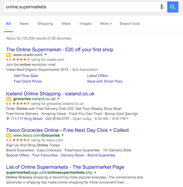
The organic space for ‘online supermarkets’ is dominated by comparison sites, or news publisher articles comparing various online supermarkets. So it makes sense for any supermarket to take out paid ads here, as they’re otherwise not going to make an impact on the SERP.
So here you can see three ads from three of the biggest UK supermarkets offering home delivery. You’ll also notice the word ‘groceries’ highlighted as a search term, which is a testament to Google’s improved handling of synonyms.
Although there’s very little to differentiate these three (especially with the aggregated customer scores), there are a few minor ‘persuasive differences’…
Ocado probably has the least practical info, but it makes up for it with attractive, white-space-creating sitelinks each promoting a different money saving opportunity. But most obviously of all is the fact that Ocado is the only one here offering cold-hard discount on your first shop.
It’s difficult to argue with this, and you may as well take advantage of the opportunity even if you never use Ocado again.
The key to succeeding with this strategy though is offering exceptional customer service with this first shop to ensure customer’s think twice about going elsewhere.
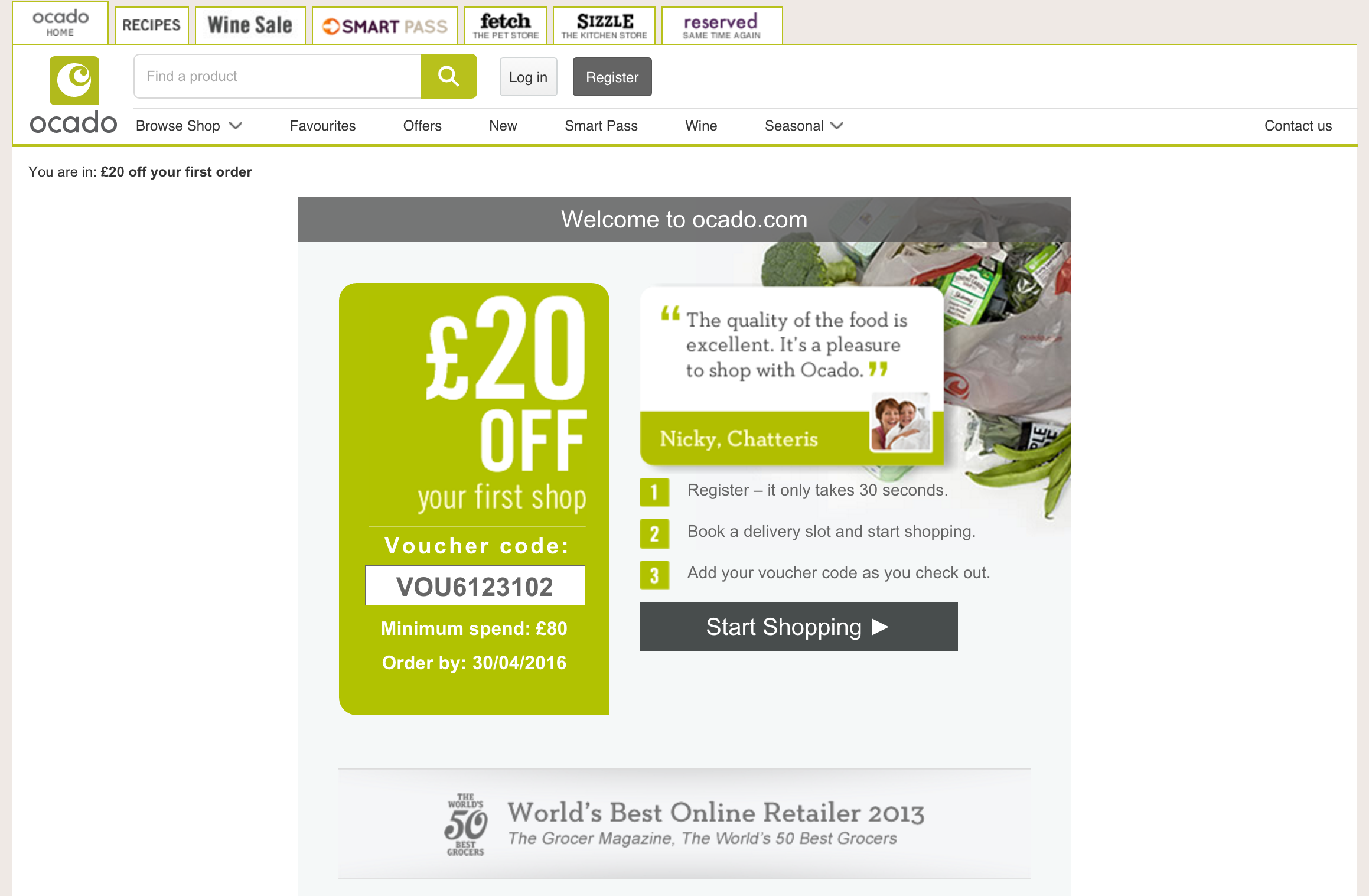
As for the landing page the ad leads to, it’s a winner…
As well as the bid amount, Google uses a quality score to gauge which adverts are shown in the most prominent position, and a fundamental part of this is whether the linked-to landing page is relevant to the ad itself.
Ocado’s does the job perfectly with its prominent discount message. Ocado has also included simple steps to how to use the voucher and a clear ‘start shopping’ CTA.
Iceland offers a strong ad here, especially in terms of detail and an impressively low free delivery threshold. Perhaps this would be better placed in the blue linked headline though.
Where Iceland’s ad excels and the others do not is remembering that searchers may not necessarily be looking to do an online shop right away and maybe just want some store details. Iceland therefore offers details on its nearest store, with an address, opening hours and phone number (which is click-to-call from mobile results).
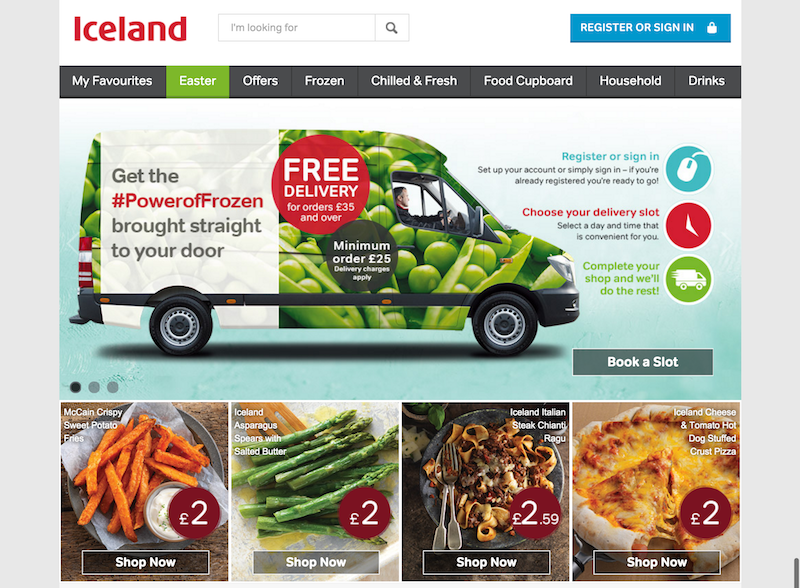
The landing page is fairly functional, but clearly laid out and unfussy…
It could perhaps do with using a single clear CTA, as it’s indistinct what I should do first, register or sign in?
There’s also an argument to suggest that ‘register or sign in’ isn’t the best messaging either, as it feels like its presenting an immediate barrier. Would ‘begin shopping’ or ‘let’s get started’ be far more persuasive?
Tesco has the weakest ad of the three. Choosing not to offer a discount, detail a free delivery threshold or offer info on a nearest store. In fact the text of the ad itself offers four fairly boring, meaningless proposals (1hr Delivery Slots – how is this different to the competition?).
The only thing in its favour is the ‘Free Next Day Click + Collect’ offer, but if I’m looking for online shopping, I’m probably not interested in physically visiting your store any time soon.
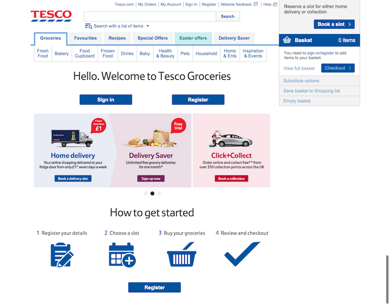
Tesco’s landing page is the most functional of the lot. But it doesn’t matter as long as it works properly and is easy to navigate…
The text here could be much larger and darker to help with readability, and the multiple blue CTAs don’t help to ease navigation. But the ‘how to get started’ instructions offer clarity for any newcomers. Perhaps this could be much higher on the page, and have more navigation options integrated into each step, in case anyone landing here isn’t a first-timer.
‘best online supermarkets/grocery shopping’
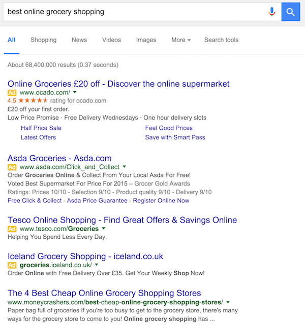
Let’s wrap this up by checking if any supermarkets have been savvy enough to bid for search queries that are used by people actively trying to seek advice from third party sites…
And yes, as expected the organic results are dominated by comparison sites and ‘Which’-type publications, but Ocado, Asda, Tesco and Iceland have all taken out ads here too.
In fact, Google has decreed this search term as particularly ‘lucrative’ because it has served four PPC ads here, as it stated it would since the removal of Right Hand Side Ads.
Now that the paid search space completely dominates the fold here, is there any point in supermarkets bothering to rank organically for this or similar search terms using SEO or content marketing? Probably not.
Better get your cheque book out then supermarkets.
The article Customer journey from search to landing page: UK supermarkets was first seen from https://searchenginewatch.com


No comments:
Post a Comment