Adwords has been around for a long time. When the first 350 users logged in, they were greeted by a stripped-back, spreadsheet-based display very similar to the one we see today. They were also possibly listening to ‘Bootylicious’ (but not on their phones).
The world, the ad market, and Google itself have all changed dramatically in the past 15 years, and it’s fair to say that AdWords is beginning to show it’s age.
A big part of this is down to design. Devices, interfaces and availability have all fundamentally changed the way people find things online.
According to Google’s own announcement:
“The days of predictable web sessions have been replaced by numerous short bursts of digital activity throughout the day, primarily on mobile. In these micro-moments, consumers expect ads to be helpful and relevant – whether that’s showing product details, directions to the nearest store, a phone number to call, or additional information about the business they’re interested in.”
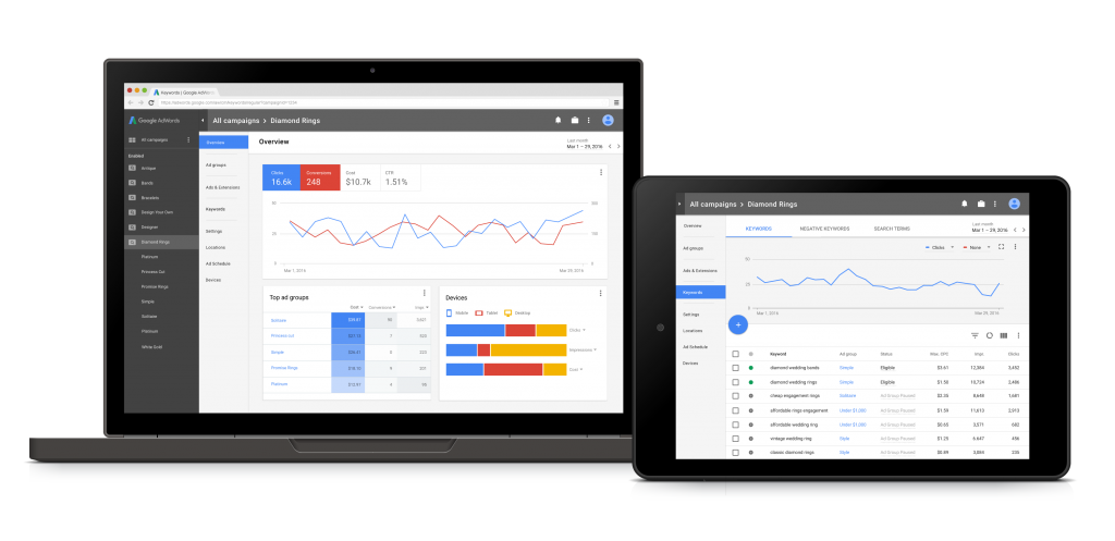
The glimpses of the redesign that have surfaced so far all point to a focus on the visual, with material design elements throughout, and clearer graphing that should surface insights that would have required spending time with pivot tables in the past.
Will it be more useful?
It’s such an inbuilt part of our everyday workflows that it’s easy to forget just how important AdWords actually is. With revenue in excess of $70 billion last year, this is the money-printing machine that allows Google to exist. Building robotic cars and cardboard Lawnmower Man headsets are minor hobbies by comparison. If there’s one thing Google can’t afford to do, it’s upset AdWords users.
Looking at the new ‘Overview’ screen, things are undoubtedly simpler:
The most relevant metrics are front-and-centre here: Clicks, Conversions, Cost and CTR. While further down, graphs display the ad groups that are performing best, and a nice graph displaying your split across devices.
It’s also nice to see a simplified navigation menu, which should mean less time messing around in settings to find location data.
The core functions do not seem to be affected (although Google has admitted that it will keep ‘tweaking and testing’ the new design as it rolls out over the next year or so), but this clearly underlines Google’s commitment to a unified design system across all of it’s products, and a focus on usability.
Currently AdWords is very hands-on, which (as with Google Analytics) can be a good thing when you have a specific question in mind, but can otherwise be a little overwhelming.
Here there’s a fundamental understanding of how people use AdWords day-to-day, and a focus on making the most important numbers fast and easy to find. This fits nicely with the philosophy we saw with Google’s new 360 suite, where different data sets are more readily available, allowing the user to interrogate data more easily.
How important is this?
The answer isn’t clear. It looks nicer, it should save you a bit of time. At its core though, AdWords is relatively unchanged. It does seem that Google is making the service a little more ‘marketer-friendly’. In an interview with FastCoDesign, Google Head of UX Greg Rosenberg underlined this:
“We want these [insights] to pop out to people, and we don’t want people to have to read the UI.“
Essentially this is making the service more approachable, which should be good news for the thousands of smaller businesses who utilise AdWords and may not have formal training or dedicated staff running their campaigns.
For the rest of us, it’s no major shakes, but it could be read as a further indicator of a shift in focus; away from ‘words’, and towards ‘behaviors’.
The article Google has redesigned AdWords: what does this mean for you? was first seen from https://searchenginewatch.com

No comments:
Post a Comment