The F-shaped pattern has been the commonly understood way in which web users browse sites and search results.
Has user behaviour changed since then, or have perhaps the changes that Google and others have made to the presentation of search results made a difference?
An eyetracking study carried out by ConversionXL looks into this question, comparing the results with previous studies.
Here are a few key findings from the article…
The F-pattern no longer holds up
The F-pattern was something discovered during testing by Jakob Nielsen. The finding being that users read or scan pages in two horizontal movements followed by a vertical movement. Thus the F-shape.
For search results, as in the example shown on the right below (this is from 2006) we can see that the first two or three results attract most attention, while results below four or five downwards attract less interest.
Now the SERPs are different. We have more images to catch the eye in some results, as well as features like rich snippets, which stand in contrast to the more text-heavy Google results of the past.
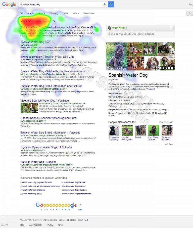
Perhaps as a result of this ConversionXL were unable to replicate the F-shape in their tests. In the example below, the first result gets the maximum attention, with very little below the third result.
Google was right to remove right hand side ads
Google’s removal of right hand side ads earlier this year is backed up by the study.
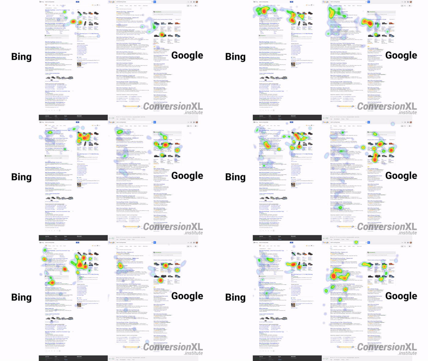
In a nutshell, ads on the right didn’t get much attention, but ads at the top of search results did, at least until users realised they were ads (explains the green text I’d say).
Contrasts between Bing and Google
The study found a few differences in user behaviour on the two search engines:
- Users took longer before exploring below the fold on Bing. Google users began to view below the fold after around 7.1 seconds. On Bing this figure was 10.5 seconds.
- Bing users spend more time viewing results above the fold. On Bing, users spent around 9.8 seconds compared to 7.8 on Google.
- Bing users took longer to view the first organic result. On Google, users viewed it after 3.3 seconds. On Bing this was 8.8 seconds.
In summary
I’d recommend reading the full article for more detail around the tests, but there are some interesting findings.
It seems that the f-shaped pattern may be no more, though I’d like to see other eye tracking studies before drawing that conclusion with certainty. There are so many variables – number of ads in results, images, featured snippets etc – that can effect the reading pattern.
There may well be a number of different patterns according to result types and, of course, user behaviour may change according to the intent behind the search.
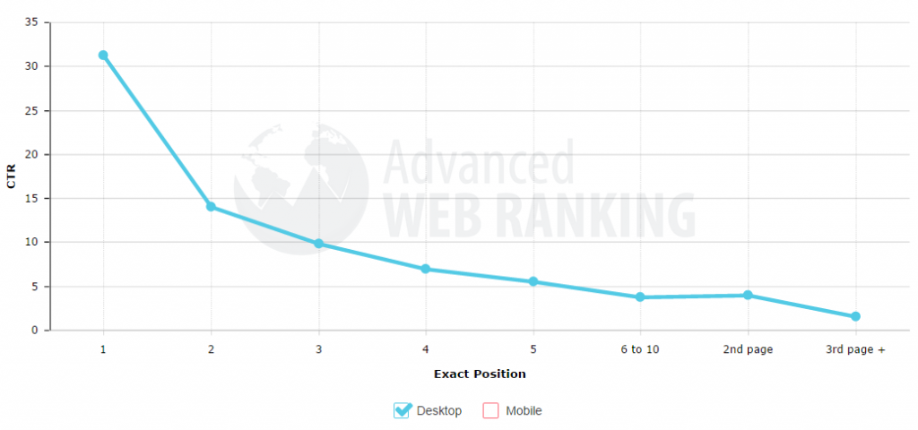
One thing seems to be clear though – the top two or three results still command most attention. (This is from an Advanced Web Ranking CTR study in 2014)
The article How do people view search engine results pages? was first seen from https://searchenginewatch.com


No comments:
Post a Comment