In this post, I’ll look at how brands are making the most of data visualization and data-informed product design to bring out data’s creative side.
Prompted by the agenda of a conference I recently attended, I asked myself a random question: is big data actually still a thing?
My conclusion was that it is, and is likely to remain so in the near future, though in a slightly different way. My view is that we will be seeing a lot more of data’s creative side.
So what it is data’s creative side?
The developed area in this regard is probably data-informed user experience (UX) design. But this is just the tip of the iceberg.
There are (at least) two further areas of data-centric creativity that are growing rapidly and worth a closer look.
1. Data visualization – the communication of data in an easy to digest way
All the data in the world doesn’t mean anything if it cannot be understood clearly. For it to be understood, it should be communicated in an easy to digest manner. And that’s where data visualization comes in.
The visualization of data is often overlooked, especially here in Asia. If you’re guilty of doing so, here are two consumer-facing campaign examples that should put the presentation of data back on your radar.
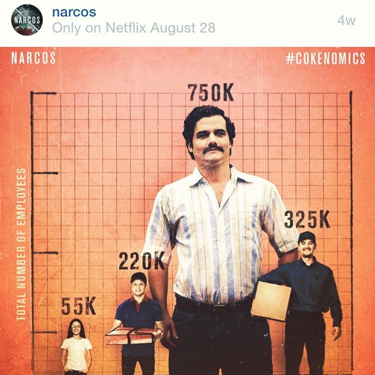
Netflix: #Cokenomics
In order to promote the TV show Narcos, which tells the story of Pablo Escobar, Netflix created infographics that brought the economy of the Columbian cocaine trade to life in a socially engaging way.
Netflix built a whole campaign around the Columbian cartel’s cocaine data under the hashtag #Cokenomics.
The Twitter account @NarcosNetflix has almost 67,000 followers and posts regular tweets such as this one:
Geniuses are always branded as crazy. #Narcos pic.twitter.com/zPhzFQ8eLv
— Netflix UK & Ireland (@NetflixUK) February 16, 2016
Here’s an example of content for Instagram:

The agency behind the campaign – Mistress – says its initial campaign drove more than 100,000 engagements.
Spotify: Found Them First
Spotify’s Found Them First gave music fans a way to prove that they were really into certain bands and singers before they actually became famous, for the bragging rights.
Users’ listening data was used to show users all the artists they had discovered ahead of other Spotify listeners.
Within weeks of the launch in October 2014, the campaign had received more than a million visits and 100 million social media impressions, all without any media spend.

Data tools
Data doesn’t actually need to be communicated to customers directly in most cases, but it’s important to get this across to internal stakeholders.
For such circumstances, there are several tools that can help you avoid the all-too-common walls of text with stock charts presentations, and substitute them with something a little more engaging and inspiring.
For example, if you are looking to beautify your charts, graphs, maps and timelines, check out the likes of RAW, Datawrapper, and Timeline JS.
Should you have a little more time on your hands, and you also know how to code, have a look at D3.js, which comes highly recommended by my own team’s creative technologist.
If you really want to up your data visualization game, you can take some inspiration from Hans Rosling, known for his unconventional ways of bringing subjects such as population growth and income equalities to life in a more tangible way.
2. Data-informed product design
Another space to watch is data-informed product design. Now I’m not talking here about your typical research-initiated product innovation cycle. I’m talking about an evolution of data visualization that quite literally and directly translates data into an actual product.
Here are three of my favorite projects within this space. I can’t wait to see more like this.
Flowing Data: Multivariate Beer
Nathan Yau from Flowingdata took U.S. demographics to brew four different types of beer.
For example, he mapped population density to the total amount of hops, and ethnicity to the type of hops used.
See Flowingdata’s website for a more detailed description of the process and other ways it transforms data.

Tempescope
This was invented by Japanese software engineer Ken Kawamoto. It’s a device which displays either current weather conditions or forecasts them physically.
Meshu
This is a concept which takes important life locations such as cities or even specific street addresses, maps the paths between them, and finally transforms them into a piece of jewelry.

The examples above demonstrate that there are no boundaries to data’s creativity, though a lot of it is still driven by artists, entrepreneurs and scientists. I hope that, in future, the marketing and advertising industry will recognise more strongly the beauty that lies within data and the compelling stories it can tell.
Storytelling is after all, a major part of our jobs.
We have moved far beyond the question of whether data enables or hinders creativity. The question nowadays is how can data itself become even more creative?
Have anything to add? Please let me know in the comments section below.
*Featured image: Spotify / Found Them First
The article How brands are using data visualisation in social campaigns was first seen from https://searchenginewatch.com
No comments:
Post a Comment